haha i love the teddy one.
And yea the sparkle brushes worked out nice in the last one.


haha i love the teddy one.
And yea the sparkle brushes worked out nice in the last one.
My threadhttp://forums.eyesonff.com/showthread.php?t=91051
-3 time sigmaker challenge Winner
Too tall. Maximum signature height is 250px. Please read the Signature rules and feel free to PM a mod/admin if you do not understand them. -Rantzien
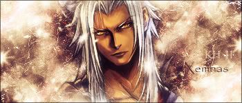
heh thanks NaroK
anyway more sigs
yeah i know they're without renders but i'm just messing with a different style... but here's one with a render even though it's nothing special...
=====>Check out my sigs!<=====
Hm abstract banners are quite hard to make! I've been trying to make one but when a sig with a render the focal is on the render. If u don't have a render you have to create a focal!
Last one bg is kinda empty, try to fill it more and mixing it with the render. Also gold goes ok with black but even better if it had a glow
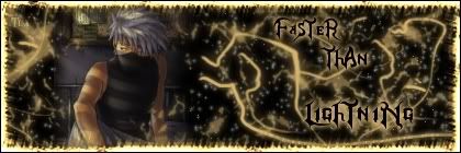
Don't put text on an abstract banner! It's not really necessary! On the third one it says' faster thabn lighting' but sig is pretty still you knwo there's no action in it. Perhaps start there
thanks for the advice Polaris, i'll keep that in mind for future sigs
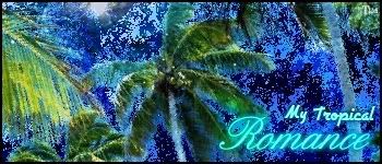
here are two more sigs i made...
I like these two alot actually... the style is really cool I think ^^
=====>Check out my sigs!<=====
Hm not reallyThe bg is messy and it looks lq
First one doesn't really know what the render is but work on contrast also the font doesn't fir, try to use Times New Roman and Serif in less than 13!

I agree with Polaris on this, it seems a bit too noisy, the first doesn't have that much but prob try smoothing the images after these, just suggestion, i've never tried it myself, but why not crack it a shot.
Thanks for the comments guys, although for now I don't think i'll change them, maybe when i have less things and other sigs to do...
but here are some new ones ^^
they're two different versions, tell which one you like the most ^^
(last one is completely without brushes)
=====>Check out my sigs!<=====
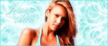
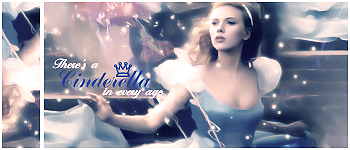
I like the first one! It's way better than ur last one still the cyan gives too much bright to the sig! I understood what u wante dto make you wanted the render to contrast with the bg and her bikini in fact match the colour of the bg but perhaps a different mix of light blue (not cyan) and yellow would be nicer
Jessica alba!!! i like the first one more the text works better and the
2nd one is just too bright!
My thread
-3 time sigmaker challenge Winner
Too tall. Maximum signature height is 250px. Please read the Signature rules and feel free to PM a mod/admin if you do not understand them. -Rantzien
okey 2nd too bright, got it
here are some new ones...
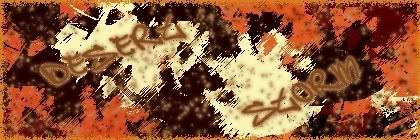
I decided to make something good out of the "desert storm" sig i posted a while ago... so i added a render and made som modifications:
Desert Storm >>> Motorstorm
(in my opinion it came out great, and way better than the original one...
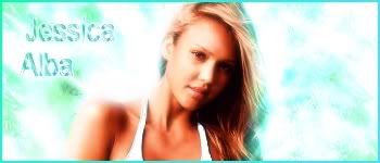
second is another Jessica Alba sig... I really loved the render for this one although i'm not sure on the result so a remake might be in place...(hope it isn't too shiny XD)
yeah well what do you think?
=====>Check out my sigs!<=====
The Jessica Alba sig si cute but the first one the bg is still not right there is no flow :\ perhaps if you'd have smudged a bit around the bg where the layer is it'd be better
But keep going
This sig is really cool, the colors are great if the text was a bit smaller I'd have said it is (Awesome) just reduce the text and it'll look (awesome).Originally Posted by Timster

The Jessica Alba one is so cute and soft, but your text is waaay too big.
keep at it. ^^
Current goal: learning drawingNext goal: SQL coding
thanks for the advice
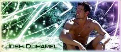
original image: http://i151.photobucket.com/albums/s...oshduhamel.jpg
so what do you think?
=====>Check out my sigs!<=====
All i could say is..:
" you.. are so pro.. "
Bg could have had different treating. Give up brushes
 Posting Permissions

 Reply With Quote