I love the second one borderand the first one sig ^^ download gimp 2.4!
you can use PS brushes


I love the second one border


Is it any better otherwise? gimp 2.4?
Nice sigs, timster! keep up the good work!!

thanksthat border is my own invention hehe
I'll try to up the sigmaking a bit, but i've got so much at school right now that i don't know if i'll be able to... but i have some new ideas for sigs so we'll see i guess...
and yeah I'm thinking about upgrading as well... when i find the time that is...
EDIT: I made a halloween-style bg for my friends PowerPoint-Presentation for their physics-project and well... it's okay i guess...
Last edited by Timster; 10-26-2007 at 07:12 PM.
=====>Check out my sigs!<=====
sry about the double post but you guys are too slow at commenting!!!!
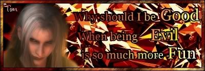
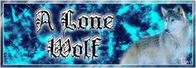
anyways i've made a couple of new sigs...
anyways i would REEEEEEALLY appreciate some comments and critique!
=====>Check out my sigs!<=====
Hm first one is the best! Second the image is too blur while the bg is too sharpen and harsh! The last one the colours are cool but still bg and render don't match!Do you have the new gimp 2.4?

Ya..the first one is the best.The 2nd and 3rd ones the render doesn't seem to be too blend into the BG..kinda like a copy paste..the first one is perfect.
想要對妳說的 不敢說的愛
Love it tim! you've gone beyond your beginner skills, now, are you ready for more harsh critiques? lol, just joiking, but im serious your really improved! especially how you blend, -Which i still do not know how -.-"-
thanks to everone who commented, i appreciate it alot you know
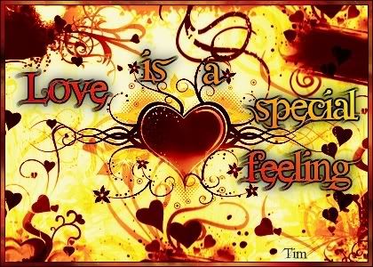
just something i made while at my friends house studying...
=====>Check out my sigs!<=====
heeey sry bout the double post but you guys are tooo slow at commenting!
anyways some new sigs... not exactly my usual style...
used polaris's sigs as an inspiration for the style of this one... although it's no where near as good as her sigs...
=====>Check out my sigs!<=====

I think the first one looks just a little too crowded with feathers.
I like the second one, but I think typing your name in blue kind of threw it off a little. Good work though.
placeholder_text.jpeg
OMG, I love this one ^^
Honestly, if I didn't like my own sig so much, I'd use it!
I see what you meant when posting in my topic
Selena
http://clairvoyance.game-server.cc/nc_catastrophe.html
Click the link to see the best flash movie EVER
I love this one the. The colour, text, brushes, border etcetc flawless!
My thread
-3 time sigmaker challenge Winner
Too tall. Maximum signature height is 250px. Please read the Signature rules and feel free to PM a mod/admin if you do not understand them. -Rantzien
dude, you've got to continue making sigs! i can see improvement in the coming 08
i've made some new sigs which i haven't posted but i'm starting to up my sigmaking speed... so there'll be more soon
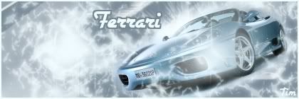
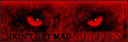
this is too big to be used at this forum but i didn't compress because it got really ugly and the quality sucked bigtime... but i think the sig itself is awesome (and i made everything but the eyes which i just altered a bit...it came out pretty cool i think at least ^^ my friend thought that the rest was a render when it's really a whooooole bunch of brushes filters and other stuff XD so i did a good job i guess XD)
this was going to be my entry for the previous sigmakers' challenge... buuut i was um... late again so... i didn't submit it in time and it got left out ...
c&c is appreciated
anyways more coming soon! ^^
=====>Check out my sigs!<=====

No, the sig isn't bad, but I still think you have better ones ; )
You are practising well, keep the good work, mate.
 Posting Permissions


 Reply With Quote