


Hii, i'm new at making sigs so i was hoping that i could get some comments on them, to see what other people think. Now, they're no where near as good as many others in here so i don't expect you to say so i just wan't some honest feedback. I'm not that good but i hope to be in the future...
here they are, i made everything but the aeon myself:
I think the shiva one is ok, just plain...
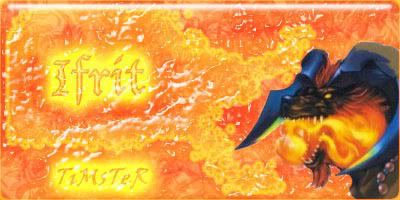
but the ifrit one i like...


 Reply With Quote