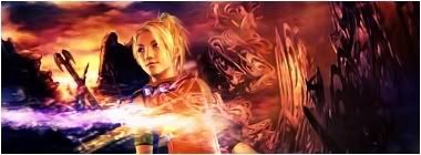
TiMsTeR_Of_hEaVeN - I think your Shiva one is the best so far, from this page. Easy on the eye, nice colours. Just a bit overly large for my personal tastes
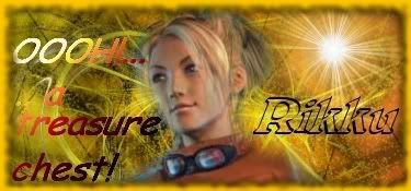
The latest - coca cola text! XD I find the lights look a bit like an overused flare lens type effect but I like the swirly stuff going on faintly in the background. Maybe you could limit the lights to one edge or corner.. Also with all those effects everywhere I think its hard for you to make that text stand out no matter what you do to it.
I'd suggest moving the keyblade up and to the left maybe, or getting a larger section of it. Taking away the effect except from some of the right side. Then you can hopefully see your text and make it a bit more simple.
At the moment it hurts the eye a bit. But as I say some of the stuff going on looks good, just try and make it a bit more subtle?



 Reply With Quote


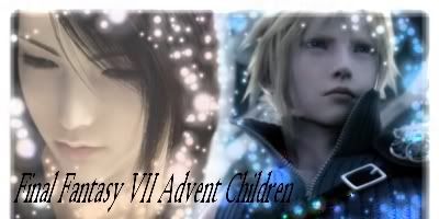
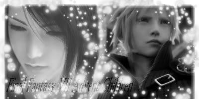

 Maybe you should have put a shadow with the fuzy circles
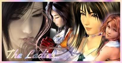
 so if anyone has a tip of where i can find one i'd really appreciate it, or if you have one already i can look at that too...
