Page 13 of 15 FirstFirst ... 3789101112131415 LastLast
Results 181 to 195 of 216

Thread: TiMsTeR's sigs

  1. #181
    GoDLikE Timster's Avatar
    Join Date
    Jan 2007
    Location
    Heaven of course...
    Posts
    553

    Default

    Thanks Kanshisha you're not so bad yourself

    and yeah Polaris I know... as a matter of fact I had like 5-6 different versions and i just couldn't decide and didn't have the time to do them all... so I just chose the one I liked the most, maybe not the best but still... though believe me when i say that i know it could have been treated differently...

    and unfortunately I haven't learned c4ds yet, but i will... eventually, can't do all at once... and i really think they're cool so there'll come a time for that too... although I am trying to reduce the use of brushes...

    and now to the new sig the (hot?) guy theme continues (so all the girls can go "YEY" and to all the guys, well maybe some of you like it as well, but there'll only be a couple more sigs, so don't sweat )
    this sig is of Josh Hartnett, the dude from 40 days and 40 nights, among other movies... and this is the image with the render i used;http://i151.photobucket.com/albums/s...tnett_mp02.jpg

    and the sig:

    =====>Check out my sigs!<=====

  2. #182
    Polaris's Avatar
    Join Date
    Apr 2004
    Location
    Sunny Portugal
    Posts
    6,186
    Blog Entries
    1

    Default

    c4ds aren't that bad to use! Just paste them and adapt to the render. Never EVER make a bg with a c4d! lately a lot of beginners have been doing that and actually I never tried but the banner it's just not natural like that. For this sig smaller would be better << And effects should be around him not on the corners! Forget the corners put effects around the renders and light there otherwise people will look at the big spot of light on the left instead of looking at the guy.... even though he's half naked

  3. #183
    Hikari Lady White_Dove15445's Avatar
    Join Date
    Sep 2007
    Location
    In my heart
    Posts
    136

    Default

    Well, Polaris I do not agree with you about the white spot what so ever, heh.
    I think it gave a nice water refelction to the BG so the brushs on the right should be of the same type and not stars that'd make it look er... sort of decided in theme, cause stars obviously don't mix with water that way. ^^
    I'm also going to add that the render needs more blending and text is too big again, BUT (I hope you didn't think I'll keep on going about complains xD) the lightening is wonderful, the colors of the BG is nice and the render is very well cut, I thought it was render and not a stock when I first looked at the sig.
    About C4Ds I don't know how long you've been into graphic, but you gotta try 'em and see how they work, you don't have to make work out of them, just try them and all, I'm sure you'll like them. Of course you move to that stage when you feel you're ready but remember there's no such thing as 'Begginer' or 'proffisional' we are all artists as long as we can make something that people enjoy look at.
    I like that you choose what YOU like instead of choosing what HAS more work in it, this makes you a real artist if you know what I mean. I like your work, and your style and ideas and if I have forgot to mention it then... that guy is really really handsome, thanks for the treat and good luck.
    Current goal: learning drawing
    Next goal: SQL coding

  4. #184
    Polaris's Avatar
    Join Date
    Apr 2004
    Location
    Sunny Portugal
    Posts
    6,186
    Blog Entries
    1

    Default

    Well I mean beginner like people who are making sigs for the first time. And trust me when they paste the c4d then the render on top is everything less art!

    Just keep making banners And try using c4ds and other stuff you never know

  5. #185
    GoDLikE Timster's Avatar
    Join Date
    Jan 2007
    Location
    Heaven of course...
    Posts
    553

    Default

    hmm lot's of opinions i see ... yeah i'll start looking into c4ds since you insist on it so much ^^... thanks Polaris and WD for all the advice and tips, and of course for all the compliments

    and about the sigs so far... some remakes may show up in a while... because I came up with so many ideas for each sig that i couldn't fit into the same sig so i'll see what I'll do... and that way I can use your advice too...

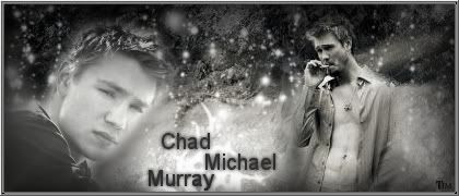
    but for now the guy theme continues, next up is Chad Michael Murray, mostly know from the series One Tree Hill... this time i was too lazy to put up the stock image(s)... but if anyone really wants to see them just pm me...

    The sig:


    Although now my supply of guys has run out (have one dude left although it's just one of my friends that fancies this guy... and the others don't think he's that handsome but you'll decide for yourselves later I guess)... BUT if anyone has any wishes or requests I'll be happy to make them just post who/what you want and maybe even a stock image or something (if you have one) and I'll get on it...

    Anyways... ENJOY...
    =====>Check out my sigs!<=====

  6. #186
    Polaris's Avatar
    Join Date
    Apr 2004
    Location
    Sunny Portugal
    Posts
    6,186
    Blog Entries
    1

    Default

    Looks cool kinda choppy and blured. Perhaps with unshaped mask and sharp would do it!

    I think you are affraid of changing your style, but I think you should definatly try out new things! Don't be affraid to try and come out a really crap because it's normal! Everytime we try a certain style the firsts will always be bad and then we just learn new secrets. Explore GIMP in a new sig that you won't show and make a mess out of it! Put textures then colours then c4ds then filters and out of that mess you'll see what you can better.

    An advice: try to make a sig with a black background post the render in the middle and play around it. Don't touch the bg! Leave it like that black and out effects around the render. You'll be quite amazed with the outcome

    perhaps you should go to planetrenders They'll be really harsh but it's the best way to develop. At first i though they were rude and stupid but with time I understood some of them were true.

  7. #187
    Hikari Lady White_Dove15445's Avatar
    Join Date
    Sep 2007
    Location
    In my heart
    Posts
    136

    Default

    Ohh!! I love this guy! xD
    And the sig looks great, I think you've done well choosing black/white over colors, but the picture on the left is not as well blended as the one on the right, that you need to fix. I admire your border though.
    Just play around with your program and try new stuff, but don't give up on your OWN style, that you should always keep.
    Good luck!
    Current goal: learning drawing
    Next goal: SQL coding

  8. #188
    GoDLikE Timster's Avatar
    Join Date
    Jan 2007
    Location
    Heaven of course...
    Posts
    553

    Default

    thanks for the comments you guys I'm trying stuff with c4ds but it's still mostly "blah" but i'm slowly getting there when I make something I think is alright i'll post it... i'm playing around with all sorts of things so i'm bound to make something different... and i'll try out the idea with the black background and effects/blending just around the render Polaris, sounds cool...

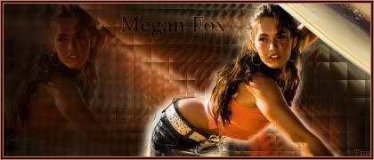
    for now there are two new sigs (actually just one sig but two versions) it's of Megan Fox, the girl from the movie Transformers... which one is better?
    Light Version:

    Dark Version:


    comments are welcome
    =====>Check out my sigs!<=====

  9. #189
    Polaris's Avatar
    Join Date
    Apr 2004
    Location
    Sunny Portugal
    Posts
    6,186
    Blog Entries
    1

    Default

    1st one! Yes that's a huge improvement and so far I see no brushes First one is better less saturated. Perhaps making it smaller! When you make sigs that are too big it's piece of cake to find bad spots! try to make them 425*124 or 350*150

  10. #190
    GoDLikE Timster's Avatar
    Join Date
    Jan 2007
    Location
    Heaven of course...
    Posts
    553

    Default

    yeah I normally prefer smaller too but I'd made only smaller ones for a while and got tired... so i'm just doing dome bigger ones for a change...

    and YEAAY no brushes... I didn't even think of that this time
    =====>Check out my sigs!<=====

  11. #191
    Hikari Lady White_Dove15445's Avatar
    Join Date
    Sep 2007
    Location
    In my heart
    Posts
    136

    Default

    I prefer the first version because the light source is better positioned than in the second one and there's depth in the whole image while the second version lacks that. Nice BG and good blending even though it really needs a bit of more work there. Really good try with no brushs but also remember brushs are needed sometimes, using the default brushs to make splended effects is what makes a good artist, so don't give them up completly but don't use them as the major thing in your work.
    Lots of good luck, Tim! ^^
    Current goal: learning drawing
    Next goal: SQL coding

  12. #192
    GoDLikE Timster's Avatar
    Join Date
    Jan 2007
    Location
    Heaven of course...
    Posts
    553

    Default

    Thanks you guys for all the support and great advice.

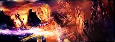
    and check it out !!!! my first sigs with c4ds in them !!!! (and for firsts they're actually really good I think, you can't be an expert frmo the very start so ^^)

    Fergie (I love this one, my personal fave):


    A Request, the person is Reita from a band called The Gazette:


    (the stock images used for these two are in the attachments...)
    Attached Images Attached Images
    =====>Check out my sigs!<=====

  13. #193
    Polaris's Avatar
    Join Date
    Apr 2004
    Location
    Sunny Portugal
    Posts
    6,186
    Blog Entries
    1

    Default

    Indeed they are quite good! But the second one I think you should work on blending! The effects are literally swallowing the girl

  14. #194
    GoDLikE Timster's Avatar
    Join Date
    Jan 2007
    Location
    Heaven of course...
    Posts
    553

    Default

    hahaha it's actually a GUY and not a girl... (but don't worry i think he looks like a girl too, but my friend always freaks out and goes "it's a GUUUUUY!!!" when i say so + she really likes the band and thinks they're hot so i've gotten used to it... but still it's a guy XD *coughNOTcough*)

    and also she requested alot of effects... but I agree the guy get's all swamped in effects...
    =====>Check out my sigs!<=====

  15. #195
    Polaris's Avatar
    Join Date
    Apr 2004
    Location
    Sunny Portugal
    Posts
    6,186
    Blog Entries
    1

    Default

    Yes but if a person requests a sig and says lots of effects you better advise the person that lots of effects = not good! ^^ At least I think that people who take request should present ideas but not always the idea is smth good!

Posting Permissions

  • You may not post new threads
  • You may not post replies
  • You may not post attachments
  • You may not edit your posts
  •