lol m8! Fofa!
Hm I've seen better from yours! ^^ Anywho get rid of that blury border, do you have GIMP 2.4? Coz it has some cool brushes for PS and they're reeeeeeally helpful

lol m8! Fofa!
Hm I've seen better from yours! ^^ Anywho get rid of that blury border, do you have GIMP 2.4? Coz it has some cool brushes for PS and they're reeeeeeally helpful


I haven't taken a look at your work lately, it has really improved very much, the red eye sig is so scary and very very well blended, I just think that the right side of the text look out of place, but still very cool.
The other latest sigs are all so great, that 'love is a special feeling' one is fantastic, it got a very nice cheerful feeling into it, the others as well. keep them coming, keep them blooming. ^^
Current goal: learning drawingNext goal: SQL coding
thanks for the comments everyone
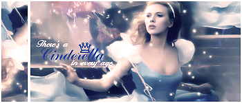
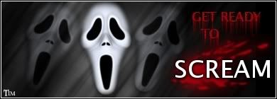
i have some new sigs ^^
they all have the same theme kind of... credit goes to faboarts at deviantart for making all the incredible renders ^^
i have some more renders that i might use but for now these will do...
my fave ^^ (i really love the penguin)
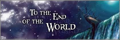
another one
and then the one that i think turned out the best ... like sigwise i mean with skill and all that...
anyways comment away peeps! ^^ hehe... and there will be more sigs coming soon as i have some free time now
=====>Check out my sigs!<=====
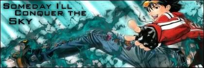
Remove the flare on the last one! Add contrast
Hmm, contrast? yes, I think that'd apply here but the flare isn't baaaad anyway! these are all so cute. ^^ I like the penguin too, he's really cute. the backgrounds are soft and cuty, keep up the great work, Tim. ^^
Current goal: learning drawingNext goal: SQL coding
hmm maybe some contrast could do but removing the flare makes the sig extremely bleak... gloomy and dark kind of... and it only seems to get worse without the flare...
thanks for the advice though... i'll remember it; CONTRAST... and i'll make new sigs with lots of it
=====>Check out my sigs!<=====
great text, great blending etc etc! And they set a nice mood i rekon good job!
My thread
-3 time sigmaker challenge Winner
Too tall. Maximum signature height is 250px. Please read the Signature rules and feel free to PM a mod/admin if you do not understand them. -Rantzien
Yeah..those are really quality sigs.Great Job.Awesome.
想要對妳說的 不敢說的愛
Colorful~! I like it ^^. good work tim,
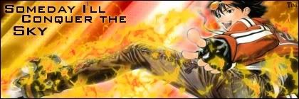
Although, i agree with Polaris the flare on the last sig will either be removed or softened..
Good luck on up coming sigs.
thanks for all the comments guys
new sigs! actually it's just one sig but two versions...i had a hard time with these and at one point i even quit on it... only to be convinced by a friend to finish it and i ended up making two versions...
the render is from a manga my friend convinced me to read... haha it's hilarious.. it's called Air Gear if anyone wants to check it out...
anyway... i'd love to hear some opinions on which version is the best... and of course if there is something good/bad in either of the versions
=====>Check out my sigs!<=====
First one is better! ^^ Nice use of brushes! Work on text and depth
i made yet another version of it... although it's mostly just a colorswap... anyways let me know what you think of it! ^^
a new style i'm trying, more realism and stuff like that...
and this one too... people think that the whole bg is just one render but it's a loooot of blending in that sig... it just doesn't show which in a way is great...
comment away peeps! ^^
=====>Check out my sigs!<=====
sry about the double post but here are even more new ones!
noooow you can comment away^^...
=====>Check out my sigs!<=====
Uhhhhh last one is the best! You should keep that style! Very clean and dreamy! Not with too many brushes and text even though it's big it fits perfectly
thanks polaris ^^ i like that one as well
=====>Check out my sigs!<=====
 Posting Permissions


 Reply With Quote