Page 14 of 15 FirstFirst ... 489101112131415 LastLast
Results 196 to 210 of 216

Thread: TiMsTeR's sigs

  1. #196
    Hikari Lady White_Dove15445's Avatar
    Join Date
    Sep 2007
    Location
    In my heart
    Posts
    136

    Default

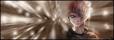
    Hmmm, I think the first is really rad, nice work with the C4Ds. As first try I am so impressed with the outcomes, they are pretty (of course except from the fact that the second one contain a guy who looks like a girl xD and that it's swallowed up) Anyway, really good work, Tim! try to look for C4Ds' tutorials they'll help you understand the way they are used better even if they are for Photoshop and not GIMP they'd still help, all you need to know is the standards then you can go skitching on your own.
    Current goal: learning drawing
    Next goal: SQL coding

  2. #197
    GoDLikE Timster's Avatar
    Join Date
    Jan 2007
    Location
    Heaven of course...
    Posts
    553

    Default

    Thanks for the advice guys

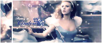
    here are some new ones, these are without c4ds but i'll still work on getting better using c4ds... these are all filters and smudging...


    v1

    v2


    enjoy
    =====>Check out my sigs!<=====

  3. #198

    Default

    These look very good too! There are so many talented people here XD


  4. #199
    Hikari Lady White_Dove15445's Avatar
    Join Date
    Sep 2007
    Location
    In my heart
    Posts
    136

    Default

    All I can say is that the first two totally ROCK!! they are great with smudging and all, wow!!
    I am not that much of a fan of the last one, it has too much empty space in it.
    But keep remembering that the first two kick!
    Current goal: learning drawing
    Next goal: SQL coding

  5. #200
    Polaris's Avatar
    Join Date
    Apr 2004
    Location
    Sunny Portugal
    Posts
    6,186
    Blog Entries
    1

    Default

    Yeah first one is your best ever Others have too much empty space! Work on blending

  6. #201
    GoDLikE Timster's Avatar
    Join Date
    Jan 2007
    Location
    Heaven of course...
    Posts
    553

    Default

    thanks for the comments, yeah you're right... I realize that the last one is empty now as well... might add an effect or something or change it sometime if I can be bothered enough

    I'm kind of swamped at school right now but i'll try to make some sigs when i have the time... but here are two new ones


    well, what do you think?
    =====>Check out my sigs!<=====

  7. #202
    Polaris's Avatar
    Join Date
    Apr 2004
    Location
    Sunny Portugal
    Posts
    6,186
    Blog Entries
    1

    Default

    NOOOOOOOOOOOO! Not brushes again -.-" You were doing so well with filters <_<

    1st one is empty LIke too much of the same brushes
    2n one colours are too bright! I took the liberty to change it, so when i present critics it won't be too hard to listen!

    Now all I did is quite simple I added a gardient map (Light purple to dark tone of a light yellow) and set it as multiply! Also to give a bit of brightness I added anothe rlayer with Gradient map in black and white and blur it then reduced the opacity by half (I don't remember if in softlight)
    Then I rippled and displace, set as multiply to darkne it and erase in some parts Then I added text in Arial Bold


    See how is softer and smaller an less empty? And it was simple!

    Perhaps consider this a colab?

  8. #203
    Hikari Lady White_Dove15445's Avatar
    Join Date
    Sep 2007
    Location
    In my heart
    Posts
    136

    Default

    Take it easy, Polaris. It is not a terrible thing to use brushs from time to time. -.-

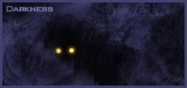
    The first sig is empty, yes but I guess that's its theme, not every sig has to be crambled with stuff but it still counts as so empty. I'd have added more eyes and maybe some kind of a scene behind the heartless to make it look less empty.

    The second, I guess it looks nice, all it was missing is depth and that was added when Polaris played with it, but as I look at both of them something about yours makes me feel like I like it better before the changes. It looks dreamy and softer and simpler. Just keep trying and playing around, you'll learn more techniques by playing around than by reading tuts and such stuff. Good luck, Tim!
    Current goal: learning drawing
    Next goal: SQL coding

  9. #204
    Free-range Human Recognized Member Lawr's Avatar
    Join Date
    Jul 2005
    Location
    right here-ish
    Posts
    5,000
    Contributions
    • Former Site Staff

    Default

    These are both really good. The first one is kind of empty but the second one doesn't feel 'empty' it just feels like something is missing. . .

    Good work anyway.
    placeholder_text.jpeg

  10. #205
    GoDLikE Timster's Avatar
    Join Date
    Jan 2007
    Location
    Heaven of course...
    Posts
    553

    Default

    thanks for the comments guys, although i do have to say something, first of all... the first one only has ONE brush in it and that is the rain, everthing else is just filters and smudging of the render, and i was going for the more simple theme yes i love the render and will probably make a wallpaper with it with more stuff in it and a scenery and all that (just have to find some stock images)... although second is pretty much packed with brushes

    Polaris the thought of making a colab is GREAT we should really make one, but maybe not this one because i actually already changed it (i thought it looked flat and not that good), and plus i already had a specific thought with it (and the text in your wasn't exactly what i'd thought...) and you'll see i guess... but next time we can make a colab from the very start if you still want to

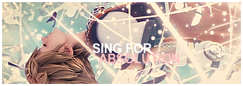
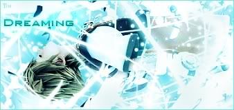
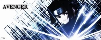
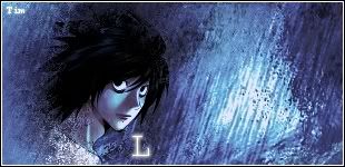
    but ANYWAY enough of my rambling, here are two new sigs and a edit of the sora one
    new version

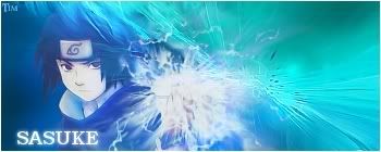
    another sasuke one, "avenger"

    death note, L


    what do you think?
    =====>Check out my sigs!<=====

  11. #206
    Polaris's Avatar
    Join Date
    Apr 2004
    Location
    Sunny Portugal
    Posts
    6,186
    Blog Entries
    1

    Default

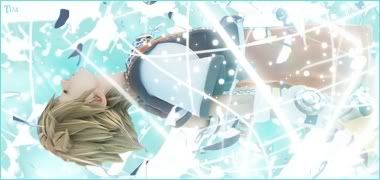
    The last one is the best! However the size ruins it it'd be better if you'd have smth like 300*125 because like that the sig looks empty! Also practise colours, they're getting too monotone An advise do colours in last and don't use colorize or Gradient Map in full!

    Well the text I put was what I felt when I saw the sig! And it's a ong from Muse where he says 'Lips are turning blue, a kiss I can't renew I only think of you my beautiful' and the way the music is really looks the way Sora is, flying almost in a transe! ^^"

    I saw a great tutorial for text in Planetrenders for GIMP! I'll pm you it once I find it. It gives a great notion of what to do and what not Appart from that also don't put "Tim" in all your banners like that! Instead try to put a watermark!

    Put text, select text and go to Layers and use delete layer! Then go to edit and stroke selection it with 1px in white! Then just use add bevel and it'll be a perfect watermark However my bevel doesn't work anymore check if yours is still working

  12. #207
    There's a Bo In My Fro Garnie's Avatar
    Join Date
    Apr 2005
    Location
    In the Basement of Alexandria Castle
    Posts
    1,776

    Default

    your sigs are sooo good! wish i could make sig's!!

  13. #208
    GoDLikE Timster's Avatar
    Join Date
    Jan 2007
    Location
    Heaven of course...
    Posts
    553

    Default

    thanks for all the advice Polaris, the color advice is something i'll definitiely think about and don't worry about the text and colab thing, and it's nice that you took the time to show your advice what it really could look like ... we'll make a colab soon and we'll ROCK and for now i've left out my name on the sigs i do...i got tired of having it without any reason on all sigs... and the watermarks are a bit unnecessary right now, but if i make a tut i'll def use a watermark

    and thanks Garnie, glad you like em

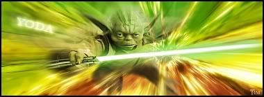
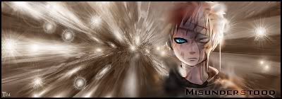
    here are some new ones...
    v1

    v2

    v3


    Work In Progress:


    thoughts anyone?
    =====>Check out my sigs!<=====

  14. #209
    Polaris's Avatar
    Join Date
    Apr 2004
    Location
    Sunny Portugal
    Posts
    6,186
    Blog Entries
    1

    Default

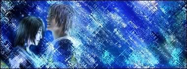
    The Tidus one is nice, maybe change the colours into smth more colourful because it's getting too monotone. And bg is all the same so perhaps add ONE brush. Because you didn't put the render in the middle so the right side is empty. Also add text! Honestly screw what guys say at PR! They say text is not necessary but I think it is!

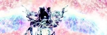
    About the WIP... it's not ur style... And it's really hard to make sigs with no bg look good. So try to use images that have a bg like the first one! They're easier.

  15. #210
    GoDLikE Timster's Avatar
    Join Date
    Jan 2007
    Location
    Heaven of course...
    Posts
    553

    Default

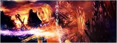
    yeah Polaris you're right, I will put text, although this time I actually felt that it made the sig worse (same with my new one which you'll see...)

    oh and the WIP is not my style, just trying something new, I added the wings myself and yeah just trying something new...

    here is a version with text and a new one
    better with or without text?

    I looooooove this one def one of my best through all time hope you love it too ^^

    tried adding text, but I thought the sig was pretty as it was so for me the other version is better...


    well what do you guys think?
    =====>Check out my sigs!<=====

Posting Permissions

  • You may not post new threads
  • You may not post replies
  • You may not post attachments
  • You may not edit your posts
  •