I heard three years ago someone was looking for that to make a tattoo out of. Well just to satisfy whoever's still looking for it i have it on my shoulder.


I heard three years ago someone was looking for that to make a tattoo out of. Well just to satisfy whoever's still looking for it i have it on my shoulder.


Ok.
pix plz
ok how do you post pics?


Host them on Photobucket or some other image hosting website. Photobucket is the most commonly used image hosting website we use here.
ok here it is.
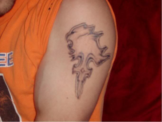

looks like an eagle lol (no offence)
George 'G-lamb' Lambert<span style="font-family: "lucida grande",tahoma,verdana,arial,sans-serif; font-size: 11px; line-height: 16px; font-variant: normal; font-style: normal; font-weight: normal; color: #555555; text-decoration: none;"> | </span>Create your badge
<3 G3ORGE Loves Klauski <3
It's good, but the head's a little off......
yeah i know the head isnt right. not really much i can do about it except probably touch it up with a nose somehow. i had him copy it off the necklace and i guess his concept was a little off.
Wow. That's, uh, dedicated.
Not really i just liked the symbol.Originally Posted by ShivaBlizzard8


I can't say that how you designed (or the tattoo artist interpreted) this symbol/tattoo was really well done. I say this primarily due to the fact that there is very little shading work (if at all, since it seems this way from the camera shot), the dimensions are slightly skewed, there is no noticeable use of colour or variation in hues or values, and there was little line variety.
In many ways, it looks akin to that of a whimsical pen-drawing upon your skin.
...
Like i sed before. not much i can do about it. but it still looks cool. and it's not shaded yet.
YOu got some nice muscles their Mr. Destroyer. So I like it I would get it but im not that hardcore
Fat kids are harder to Kidnap.

well i like that tattoo but it's not Uber like the King Mickey from KH2 i'm going to get soon ^_^. the Tattoo on you is too big or is it just your arm i don't care but the facial feature of Lionheart is not noticeable.
 Posting Permissions