Ok i barely just started making sigs advice and critisism is welcomed and please be brutally honest
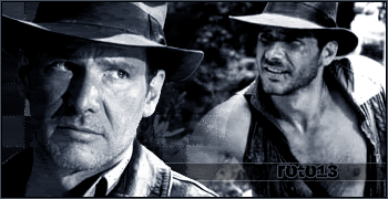
Choji(first made EVER!)
Link(fav)
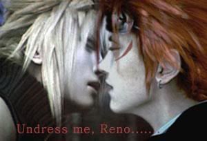
Sora/Kairi


Ok i barely just started making sigs advice and critisism is welcomed and please be brutally honest
Choji(first made EVER!)


They suck...I'm just kidding.But really they're pretty good considering they were your first ones. I think the last one is the best.

^^ Nah they don't suck even though I'd advice you to don't use light green pretty much on a sigTry to use more bg effects
Smaller sig size, better text, more effects and the most important thing of all, a border. I'm sure you'll improve though.

The base color in the tag i think youre referring to is yellow. And there is nothing wrong with green in a tag. Most people just find the discoloration of a persons skin (seeing as how a person is usually the focal point of a tag) unattractive.Originally Posted by Ice Angel

And More than one image clutters the tag. You should choose a single focal point and build the effects around it until you know how to keep flow from straying off canvas and can keep viewers interested in more than one focal point.
[leeza]This is over the 50 kb filesize limit. Please read the sig restrictions above the sig field before attaching an image. PM a Knight/Admin if you do not understand them.[/leeza]
thanks i want to know what some other people use for their sizes so i should know how mmuch i should downscale by


A border, yes. That's important.
If you want to see how big someone's sig is, right click on it and click "properties." You can use that as a guideline.
You're off to a good start.
Woo i have some new ones and yes i know no border im working on it
My first request^
EDIT also added

Last edited by Arc_Master_14; 03-21-2007 at 02:59 AM.

I love the Dance Water Dance one.
warriorboy && battlingbard.
A border is not all that important, as long as you know how to keep the flow going to the focal point.
The bevel and emboss look on the demyx tag isnt that attractive, and in all of them my eyes go directly to the text.
you should make the text more subtle and bring your stock, which should be the focal point out more.
[leeza]This is over the 50 kb filesize limit. Please read the sig restrictions above the sig field before attaching an image. PM a Knight/Admin if you do not understand them.[/leeza]

your doing really well for someone starting sigs ^^
Offline/Online
Ok i know its not great I just put it cuz I hadnt put one on in awhile
I like the first one. But they all look really good.
Its not art but hey I made these too

2 more
Requested technically
WOO I LOVE THIS ONE! lol
 Posting Permissions


 Reply With Quote