Page 1 of 6 123456 LastLast
Results 1 to 15 of 78

Thread: James Leopold's sigs

  1. #1

    Default James Leopold's sigs

    As recommended by Polaris (A while ago, I'm sorry its taken me so long to actually make this thread) I'm putting up a few signatures that I created. I am a real rookie at this though, so my sigs aren't very good at all. I hope that with some help and advice from you guys, that I can become better.

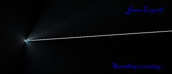
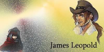
    Firstly, here are my first three sigs, they are really old. I made them when I first got photoshop elements 2.


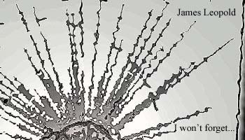
    I then got Photoshop 7 and decided to start doing sigs again about 2 months ago. I did these two...


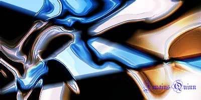
    More recently, I tried to do different styles for my sigs...


    Please tell me what you think. If you want to see different things by me, here is my photobucket account...

    thecm_93 - Photobucket - Video and Image Hosting
    Last edited by James Leopold; 07-08-2007 at 08:11 PM.

    Cheers to Polaris for the set!

    Final Fantasy's completed: I, VI, VII, VIII, IX, X

  2. #2
    Polaris's Avatar
    Join Date
    Apr 2004
    Location
    Sunny Portugal
    Posts
    6,186
    Blog Entries
    1

    Default

    Mr. Davies (lol it seems like I'm talking to Stoner )
    I visited your photobucket and I like your abstract stuff way better than the ones with the images! It's all so funky and colourful
    You should use different types of fonts within the same text So teh sig gets different too!

    Nice work!

  3. #3

    Default

    Thank you Polaris!
    Last edited by James Leopold; 07-08-2007 at 08:10 PM.

    Cheers to Polaris for the set!

    Final Fantasy's completed: I, VI, VII, VIII, IX, X

  4. #4

    Default

    They are interesting, but they don't pop. The colors in a few of them are a bit monochromatic.

    What system do you use? If you use GIMP I can teach ya some tips.

  5. #5

    Default

    your abstract sigs are a lot more attractive than the ones with characters in them. You should try some more tuts and challenges to improve. Now, join the sigmakers challenge.

  6. #6

    Default

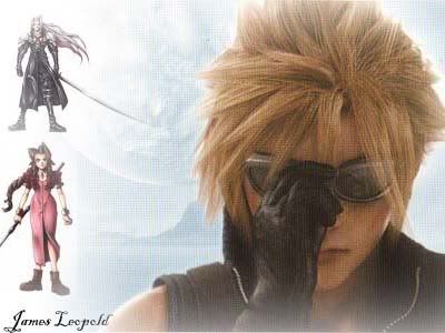
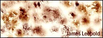
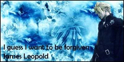
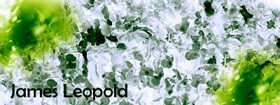
    I've made a new sig. It's a different style then my previous ones. I used a lot more brushes. I got the idea mainly from a tutorial I went on. Hopefully I can develop from here.


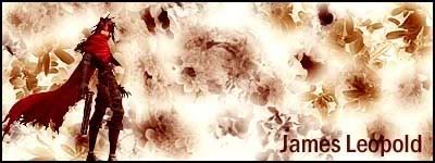
    Also with the same sig, I put an image in to see how it would turn out.


    I would gladly appreciate opinions.

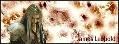
    Edit: I put an image of Sephiroth in which I think suits it.

    Last edited by James Leopold; 07-14-2007 at 01:57 PM.

    Cheers to Polaris for the set!

    Final Fantasy's completed: I, VI, VII, VIII, IX, X

  7. #7

    Default

    I prefer the one without Vincent. The one without Vincent looks pretty amazing.

  8. #8

    Default

    I agree. It's gorgeous.

  9. #9
    I'm Back~! Kanshisha's Avatar
    Join Date
    Dec 2006
    Location
    Australia
    Posts
    1,697

    Default

    Quote Originally Posted by James Leopold View Post
    As recommended by Polaris (A while ago, I'm sorry its taken me so long to actually make this thread) I'm putting up a few signatures that I created. I am a real rookie at this though, so my sigs aren't very good at all. I hope that with some help and advice from you guys, that I can become better.

    Firstly, here are my first three sigs, they are really old. I made them when I first got photoshop elements 2.


    I then got Photoshop 7 and decided to start doing sigs again about 2 months ago. I did these two...


    More recently, I tried to do different styles for my sigs...


    Please tell me what you think. If you want to see different things by me, here is my photobucket account...

    thecm_93 - Photobucket - Video and Image Hosting
    Hello, your sigs ain't bad.. if you see my thread:

    http://forums.eyesonff.com/graphic-d...rt-s-sigs.html

    Ha! see when I started?! very bad eh? well look further down onto the recent, and you see the improvements..

    Ok, Hints and tips time:

    Firstly.. The last old sig that you made, it's a great one! try keep that as a momentum..

    Secondly on the large cloud sig, that looks like a large thumbnail, try to not canvas it.. no offence but it didn't really suited in at that moment.. but, i guess, practice makes perfect! so don't give up, mistakes happen for the best of us to learn and gather information from it..

    Pictures / Images:
    the images you use are great, not sure about the Vincent ones but yeah! im impressed of your picture finds!

    Also the final two hints and tips.. ( finally eh? )
    How i started was look around at deviant art for pre-made sigs.. even look around in the forums for some! then you just cut them and put the images in your sigs! of course, only the ones you want.. But be sure to know what your looking for, do the sig before adding images!

    Secondly everyone has their own style, don't let other peoples style ruin your momentum ( gosh i love that word! ) My style is just freestyle! yah, also look at other people's posts for ideas on improvements and techniques..

    Well i hope these are plenty! Good luck with the future sigs
    Last edited by Kanshisha; 07-14-2007 at 07:42 AM. Reason: Forgot link

  10. #10

    Default

    Cheers for the advice Squall.

    Cheers to Polaris for the set!

    Final Fantasy's completed: I, VI, VII, VIII, IX, X

  11. #11
    Polaris's Avatar
    Join Date
    Apr 2004
    Location
    Sunny Portugal
    Posts
    6,186
    Blog Entries
    1

    Default

    I like it! Text still needs some work! Maybe an outline
    And Sephiroth should be witha abit of red tones! So it matches Great sig though! DA is great for PS brushes!

  12. #12

    Default

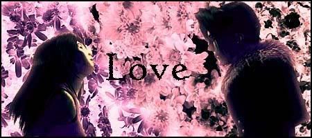
    I've made three new sigs. Please tell me what you think.


    I feel that I'm getting the hang of adding images to the sigs, but I'm still having trouble with text. I've tried to download better text from sites, but they it doesn't seem to be working.
    Anyway, I hope you like the sigs.

    Cheers to Polaris for the set!

    Final Fantasy's completed: I, VI, VII, VIII, IX, X

  13. #13
    Polaris's Avatar
    Join Date
    Apr 2004
    Location
    Sunny Portugal
    Posts
    6,186
    Blog Entries
    1

    Default

    You won't need new fonts! You can use Condensed ones that comes with Microsoft!

    Tips:

    -Choose smaller images! Not in size but cut the body to focu on the image because like that we can't even see the image clearly!

    - Use different brushes with different colours!

    - Use an outline for the text in white for an example or in the blue one in light blue

    Good luck mr. Davies

  14. #14

    Default

    The squinoa one is awesome!

    Do you know there's a cereal called quinoa like (quistis/Rinoa) lol.

  15. #15
    I'm Back~! Kanshisha's Avatar
    Join Date
    Dec 2006
    Location
    Australia
    Posts
    1,697

    Default

    Nice job with the latest sigs there friend! keep up the good work! we're always here to help if you need any that is

Posting Permissions

  • You may not post new threads
  • You may not post replies
  • You may not post attachments
  • You may not edit your posts
  •