Results 1 to 12 of 12

Thread: Stoner's at it now

  1. #1
    I Am Stoner's Avatar
    Join Date
    Aug 2006
    Location
    Allie's heart <3
    Posts
    1,188

    Default Stoner's at it now

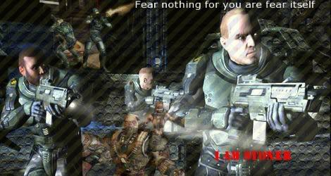
    Well i thought I might just try my hand at making sigs and stuff so here's the first one I made. Hope u enjoy it.
    I used Quake 4 pics to Create this sig as its one of my favourite games ever.


  2. #2
    Polaris's Avatar
    Join Date
    Apr 2004
    Location
    Sunny Portugal
    Posts
    6,186
    Blog Entries
    1

    Default

    I don't know what's wrong with new sigmakers, they'r first banners are always better than mine were ^^" Great work hunny and with no tuts

  3. #3
    I Am Stoner's Avatar
    Join Date
    Aug 2006
    Location
    Allie's heart <3
    Posts
    1,188

    Default

    This is a sig I made for my gf.


  4. #4
    Forever a failure... XandrewX's Avatar
    Join Date
    Sep 2006
    Location
    Behind her always...
    Posts
    2,518

    Default

    Just my opinion but if that's your first try it's good..if it isn't it your first try I would say it needs some work on it..Erm..sorry to comment it that way..but the sig only have the lines and your text..I mean there isn't much changes and..the text can be nicer.Same as the 2nd one..you just add a two brushes and a text..maybe simple is nice but to me this time it isn't the case..Sorry..


    想要對妳說的 不敢說的愛

  5. #5

    Default

    wow thats a massive improvement from the first to the second sig. good work!

    Cheers to Polaris for the set!

    Final Fantasy's completed: I, VI, VII, VIII, IX, X

  6. #6
    I Am Stoner's Avatar
    Join Date
    Aug 2006
    Location
    Allie's heart <3
    Posts
    1,188

    Default

    A new sig I made about Halo 3


  7. #7
    Free-range Human Recognized Member Lawr's Avatar
    Join Date
    Jul 2005
    Location
    right here-ish
    Posts
    5,000
    Contributions
    • Former Site Staff

    Default

    It's a good sig, but ewww, JPEGS!! OH EM GEE RUN!!!
    But seriously though, if you use too many images it might look cramped.
    placeholder_text.jpeg

  8. #8
    Polaris's Avatar
    Join Date
    Apr 2004
    Location
    Sunny Portugal
    Posts
    6,186
    Blog Entries
    1

    Default

    Use one image and make 4 banners with the images u'd put just in one That will be perfect or for an example you could use the bg image plus that one gree on the front and it'd be awsome Also don't use red on text coz after you'll save it'll look bad red and pink are horrible colours for text in GIMP! But you rock I don't help u with banners and u make them really nice!

  9. #9

    Default

    I think you could use fewer images =)

    But it looks great, for the first try

  10. #10
    I Am Stoner's Avatar
    Join Date
    Aug 2006
    Location
    Allie's heart <3
    Posts
    1,188

    Default

    I havent used any text for this sig. Instead I used the Quake 4 symbol. Hope you like it.


    Last edited by I Am Stoner; 09-11-2007 at 01:40 PM.

  11. #11
    Polaris's Avatar
    Join Date
    Apr 2004
    Location
    Sunny Portugal
    Posts
    6,186
    Blog Entries
    1

    Default

    Awwwwwwwwwwwwwwwww so sweet I like it! way better than the one I made u

  12. #12

    Default

    HMM, what exactly did you do it again? OH, right..the logo. It just seems like an image with a slapped on logo to me, perhaps it would be better with a border and affects?

Posting Permissions

  • You may not post new threads
  • You may not post replies
  • You may not post attachments
  • You may not edit your posts
  •