Page 7 of 7 FirstFirst 1234567
Results 91 to 102 of 102

Thread: My avs and banners...

  1. #91
    Selena_Akariko's Avatar
    Join Date
    Nov 2006
    Location
    I live in Russia ^^
    Posts
    407

    Default

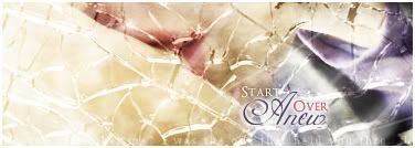
    Don't worry, Timster. I know I don't make sigs too well... You all told me my style was too simple, i.e. anime pictures+text, so I tried photo+anime+text. No good. Now I tried photo+photo+text+brushy border. Yes, now that I looked at it again, I realize that my purely-emotion sig is totally crap compared to the original photos... My only excuse is that Deviantart was glitching, so I couldn't open the whole picture of the person or get another one, so I had to use the small preview one...

    Maybe I was right... See, Polaris?

    That's it. From now on I'll open Photoshop or any other drawing program only to make a sig for my friends or for myself. No more showing off my poor graphic skills...

    Besides, sigs made for friends are always better-looking... Check Elpizo's profile and look at his sig. It was done by me.

    Selena


    http://clairvoyance.game-server.cc/nc_catastrophe.html
    Click the link to see the best flash movie EVER

  2. #92
    Polaris's Avatar
    Join Date
    Apr 2004
    Location
    Sunny Portugal
    Posts
    6,186
    Blog Entries
    1

    Default

    I think it's great you used brushes it's a great development! Everytime we start a new style it's not our best but we have to keep trying Check my banners when i started using brush! i used brush over Tom Chaplin's head!! At leats you didn't make that I believe if you keep going and practising you'll be quite better and people won't even believe in your previous work.

    I took more than a year to make smth good and even now I am really criticized by other people. I find better that you are improving and tryin to work on pictures. I don't think your previous work was better because it was no work at all! You just pasted images and added text now you used a brush. It's awsome!!!

    Don't be affraid to try new things!

    You used Ps default brushes but if you go here Browsing Textures on deviantART these are great things to start a bg instead of real images! JUST if you wanna try smth new! Among them look for smth it's you! You might see a texture and say 'oh wow I love that' and use that for a sig!

    I think that however next level would be change colours. And I have a secret. Designers now appreciate smth simple than smth with lots of effects. If you grab a picture and change some colours I think people will find it great

  3. #93

    Default

    First of all, are you ok Selena? There's something that's happening to you or something we can help?

    I also think it isn't your best sig, but something tells me that you aren't really ok emotionally, I'm right? Sometimes emotions helps us in doing sigs, but when they are really strong they damage us more thant they can help.


  4. #94
    GoDLikE Timster's Avatar
    Join Date
    Jan 2007
    Location
    Heaven of course...
    Posts
    553

    Default

    you misunderstand me... I know I was being very harsh but that's no reason to give up... just ASK and you'll get better... when I started out everything I made was PUUUUURE CRAP... but then I started looking around for tutorials that showed how to do different thing (I couldn't follow them all the way though, it felt like I was copying someone but that's just how I am...) and I got looooooooooads of help from Polaris, if it wasn't for her I'd never improve this much... and when I got better I introduced my friends to GIMP too and we started helping eachother...

    sure we all have our setbacks... but you shouldn't just quit, especially when there are people supporting you... I'm sure both Polaris and me and other sigmakers are happy to help you get better (ramza maybe, he's a GREAT sigmaker...)... and we really know that you can get better
    =====>Check out my sigs!<=====

  5. #95

    Default

    First of all, it's hard to change style. I understand how you feel, cuz I keep changing mine. And it seems good to us, when we do something new. It really does, then someone says it sucks. You just can't stop here... you just can't stop when you didn't even started. Now it's the time when you get to do a new one, just to show that you really know how to do it and that you really are keeping your style. And then... there it is. You make a better one. And then you understand what other people said about the previous one. And this is how it works.

    I know Timster was trying to help you. As Polaris did. And you know that what he said was right. But now you used a brush! And that's one big step, and you'll understand that when you see what brushes can do for you.

    So, advices? I have three:
    1) Do what Timster said. Exchange ideas, look for tuts, talk to people, ask for help. This will widden every single aspect of your sig making process. And people here in EOFF are so giving and supporting, trust me.
    2) Do what Polaris said, our sig goddess whose style keeps changing and I always tell her her sigs look like crap . And believe in her, cuz she has got much experience in sig making. Look for things you like, intertwine them in your sigs, make them about you and what you want to transmit. In the end, look at it. Does it really transmit it? If not, DELETE and start over... like i do most of the times
    3) My advice: Go on. Cuz you'll get better, as I did, as Polaris did, as everyone did. Cuz we did not born making sig. . Want to know one of the most useful brushes? A sparkle one. To make your sigs sparkly

    So, I hope you go on. And I think I speak for everyone in this forum.

  6. #96
    Selena_Akariko's Avatar
    Join Date
    Nov 2006
    Location
    I live in Russia ^^
    Posts
    407

    Default


    http://clairvoyance.game-server.cc/nc_catastrophe.html
    Click the link to see the best flash movie EVER

  7. #97
    Polaris's Avatar
    Join Date
    Apr 2004
    Location
    Sunny Portugal
    Posts
    6,186
    Blog Entries
    1

    Default

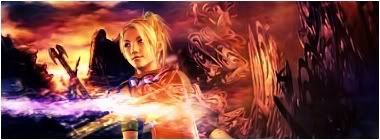
    Love the detail on her clothes But make some smaller so if anyone likes it they can use it

  8. #98
    Selena_Akariko's Avatar
    Join Date
    Nov 2006
    Location
    I live in Russia ^^
    Posts
    407

    Default

    Well, this one is max EoFF size.


    http://clairvoyance.game-server.cc/nc_catastrophe.html
    Click the link to see the best flash movie EVER

  9. #99
    Polaris's Avatar
    Join Date
    Apr 2004
    Location
    Sunny Portugal
    Posts
    6,186
    Blog Entries
    1

    Default

    Yes but if people will use the max size there will be no size if they want to add some sentences! ^^ try to make 425*125 or 350*150. When we use smth bigger it's easy to make mistakes Like people will notice is too empty or lack of effects.

  10. #100

    Default

    Maybe it's just my belief, but sometimes a lack of effects it's better.

    Anyways, the sig is great, excellent work in the girl cloth's. Maybe here isn't quite accepted because of the size, but in other places it would be pretty cool. Don't hesitate to practice with different sizes because of just one forum or one person. Experiment everything you can find in photoshop, and you'll find great things in the way . Good luck.


  11. #101

    Default

    Hello First of all, I don't think you should give up. All of us here have done bad sigs and better sigs. I have used PS for quite some time now and even though I have the excuse of the practise (I don't have time to practise that much) , many people still criticze my sigs.
    Because the reality is..you can't just please all the world.

    But there are some general things that can help you to reach a level of harmony between colors and visual of the sig.

    Right now my advice is: just keep trying, your work will get better evry day and you'll know what are your mistakes and what you're doing wrong or not.

  12. #102
    GoDLikE Timster's Avatar
    Join Date
    Jan 2007
    Location
    Heaven of course...
    Posts
    553

    Default

    this one is much better you picked a nice stock, the border is WAAAY better than before, the detail on the clothes look great (although you accidentally painted over some of her hand), AND the text looks alot better with an effect (in this case the outlines in different colors)

    it's really a big improvement, or maybe not even that... the other one was probably just that you had a bad day or something... since you've made great sigs before...(like your current)

    hmm to make this one better i'd suggest making it a liiiiiiiiittle bit smaller... because people generally don't like sigs that are big... (even if they are within restrictions), second maybe erase stuff that don't have anything with the sig to do, for example the powerline; this can probably be done by using a tool called the "Heal" tool (PS users can correct me if i'm wrong, i'm not exactly familiar with PS terms...)... anyway you should check that out... if the heal tool doesn't work you can try the clone tool, you just select a point of origin which will be "cloned" and then when you use the brush it will copy from the point of origin, so you can just select somewhere on the sky as a point of origin and clone over the powerline...
    =====>Check out my sigs!<=====

Posting Permissions

  • You may not post new threads
  • You may not post replies
  • You may not post attachments
  • You may not edit your posts
  •