Thank you... I'm really working on the colors now.
And I noticed that's a big step in sig making.
Here are some new ones:
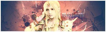
Tell Her:
Try Me:
Try Me B&W:
(And my all time favourite) Left Alone:


Thank you... I'm really working on the colors now.
And I noticed that's a big step in sig making.
Here are some new ones:
Tell Her:
Try Me:
Try Me B&W:
(And my all time favourite) Left Alone:

God I even asked keane about u todayYou haven't been online
Btw I'm already on lv 5 at bananking hihihi
about the sigs
Work more on the bg and truly in colours
GoDLikE
they're pretty good all of them... espescially Tell Her is great
although the Try Me ones are a bit boring, though I think the colored version is better...
the Left Alone sig is great but the color blurs the sig too much... there's nothing to focus on... a liiiiittle less blur and it will be awesome
=====>Check out my sigs!<=====
I'm Back~!

i really like your text fonts that you use, the border style AND the blending of your work, keep it up.
Tráfego, amiga... tráfego... loool sabado ja lá tou \o/I even asked keane about u today
God, so... much.. work..
Ok, I got some time to finish some sigs and to actually change my style.
Here they are:
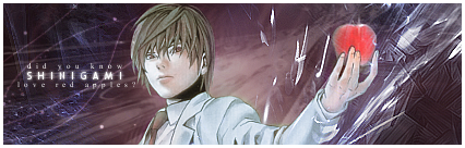
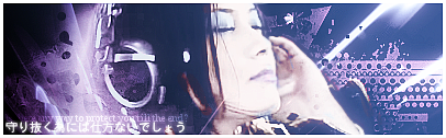
Shinigami:
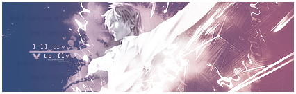
I'll Try:
Fly:
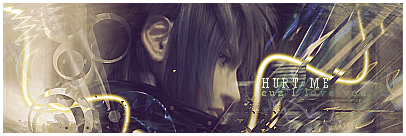
Hurt me:
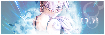
Utada:

The last one
At last you already changed your brushesThat's a BIG change! Also try to make text better i think the only thing you have to worry about is text and some colours issue!
GoDLikE
omg they're sooooooo good, really love them all
second one is a liiittle meh because the render is a bit low quality...
but the others are WOW
=====>Check out my sigs!<=====
Woow! Beautiful graphics
Thank you so much. I've been working really hard in colors and new techniques. Yes, Polaris, text text... -_-"
New ones, a gay one for Polaris (GAYNESS FTW!!!) and another featuring Yui. LOVE HER:
Loved By you:
Rolling Star:
Though I wouldn't ever use that first one, it still looks very good
GoDLikE
QFTOriginally Posted by Krelian

I like the way you work with colours... it's always really nice
=====>Check out my sigs!<=====
GAYYYYYSSSSSSSSSSSSSSSSSSSSSSSSSSFirst one is fine, second one is kinda meh with colours! And work on text FCS!!!!!

 -=Hentai School Girl=-


 Posting Permissions


 Reply With Quote