Results 1 to 7 of 7

Thread: Shadow Bahamut's sig's/banners/avys

  1. #1
    planning world domination
    Join Date
    May 2005
    Location
    in the land of reality
    Posts
    1,110

    Default Shadow Bahamut's sig's/banners/avys

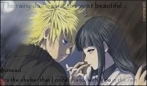
    ok, here's a few of my lastest projects. i've only been using PS7 for a few months (around 6 months) and now i've upgraded to PS CS2, which seems to be somewhat better.
    anyhow, here's my stuff that i've done for other sites and members:
    Sig/Avy set 1


    Sig/Avy set 2


    Last edited by Shadow Bahamut; 10-23-2008 at 11:10 PM.

  2. #2

    Default

    These are nice, but you need to experiment more to become better. Try different colours (you're only using dark ones at the moment) and different types of brushes. When you get the hang of that you can create your own unique sigs.

    Tutorials can really help you out. There are a lot, but this one started me off:

    Simple Sig Tutorial - for thous who are new in photoshop...

    Good luck, Shadow Bahamut. Looking forward to seeing more from you.

    Edit: Also, try using borders, they normally make a sig make more of an impact

    Cheers to Polaris for the set!

    Final Fantasy's completed: I, VI, VII, VIII, IX, X

  3. #3
    Forever a failure... XandrewX's Avatar
    Join Date
    Sep 2006
    Location
    Behind her always...
    Posts
    2,518

    Default

    Wow..those are nice sigs..but something is wrong with those..maybe something doesn't match..I dunno the text is cool and all but looks kinda choppy.And the Dante one is nice..but the text isn't that nice..so..yeah kinda lower the beautifulness of that sig.


    想要對妳說的 不敢說的愛

  4. #4
    Free-range Human Recognized Member Lawr's Avatar
    Join Date
    Jul 2005
    Location
    right here-ish
    Posts
    5,000
    Contributions
    • Former Site Staff

    Default

    Theses are pretty good, but some of them would look better with a border. Are you using Photoshop? If you are, then for the Dante one, maybe if you applied a Grunge Brush it would look even cooler!
    placeholder_text.jpeg

  5. #5
    planning world domination
    Join Date
    May 2005
    Location
    in the land of reality
    Posts
    1,110

    Default

    Well, i'm not too sure whether or not i should be reviving this thread cuz, "you're not supposed to revive dead threads", then again....they do say "only one thread per user" ...so i'm following rules -ish....

    Just some of my latest work, any comments welcome


    (a little early/late i know...but it's been a while since i've been here)

    My latest set for another forum:


    and another set:


    edit: almost forgot, if anyone wants a "set", sig or avy doing, just PM me with the details and i'll see what i can do for you

  6. #6
    Free-range Human Recognized Member Lawr's Avatar
    Join Date
    Jul 2005
    Location
    right here-ish
    Posts
    5,000
    Contributions
    • Former Site Staff

    Default

    Ha so you posted them after all! Like I said earlier, those are great. Maybe you could add a Stroke to them, and it doesn't have to be anything fancy, usually a 1 px border will do!
    placeholder_text.jpeg

  7. #7
    planning world domination
    Join Date
    May 2005
    Location
    in the land of reality
    Posts
    1,110

    Default

    Quote Originally Posted by Sagensyg View Post
    Ha so you posted them after all! Like I said earlier, those are great. Maybe you could add a Stroke to them, and it doesn't have to be anything fancy, usually a 1 px border will do!
    yeah, i've tried various types of boarder i.e. 1px line, 2px line, 2px with gradient, gradient and reduced opacity...i've tried a lot of different combos, but nothing seems to enhance them, it just seems to "busy" the drawing. As in - they're there, but they dont do anything for the drawing.

Posting Permissions

  • You may not post new threads
  • You may not post replies
  • You may not post attachments
  • You may not edit your posts
  •