the two versions for "the hero" are my favourites... they have really cool styles that i like


the two versions for "the hero" are my favourites... they have really cool styles that i like
=====>Check out my sigs!<=====
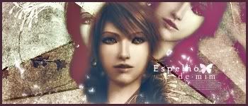
Two new ones
ORIGINAL IMAGE:
A gift to Aerith's Knight:
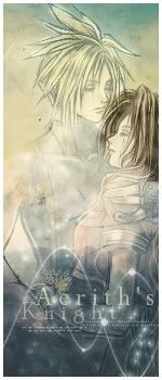
first one is too sharp and edgy espescially around the person... otherwise great
the second one is awesome... really nice ^^
=====>Check out my sigs!<=====

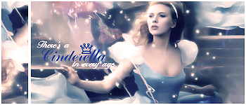
It really displays my awsomeness well ^^
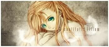
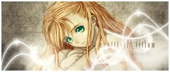
Two versions of the same picture ^^
V1
V2
ORIGINAL: Coulnd't find it it's not on the website anymore
Final Fantasy XIII
ORIGINAL: http://i108.photobucket.com/albums/n...XIIIFemale.jpg
I just realized now the first sig on my last post doesn't have a link to the original one so here it is!^^
. simple . by `karincoma on deviantART
second version is better, first is more boring, but move the text on the second one though! more to the left of the sig
the FF XIII, well it's okay i guess... not exactly my style though... and the render doesn't seem to fit in... maybe more blending ???
=====>Check out my sigs!<=====

Wow!! it has been ages since I commented here. ^^ Anyway, You have been working really hard during the time I was away and I can see huge improvement here. Only I don't like some of the brush text you used in some of the sigs, your own text looks much better than it, like the one you are using now, it looks so cool.
Keep up the work and try to lessen the use of brushs.
Good job on improving, Polaris!
Current goal: learning drawingNext goal: SQL coding
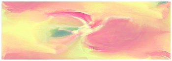
New one an abstract
I was going to make a sig with this image that it's from a game that my sister plays those games that are to dress and make up girls lol :rolleyes: anyway I grab this and decided it was too horrid for a banner so I turned it into an abstract!
This was the initial image:
After many filters
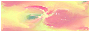
No text
With text
Please be nice
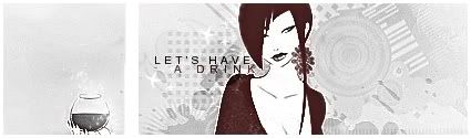
I HART YOUR CURRENT SIG
LET'S HAVE A DRINK indeed, tis fabby.
The latest one is good but it feels a bit empty.
I agree... but the one WITH the text is the best...Originally Posted by scrumpleberry

=====>Check out my sigs!<=====
Come on people be artistic, this sig looks really good and different. If it was me polaris who made that sig I'd put text as "Phoenix" Cause it completely look like a phoenix to me and I'd add some black like a shadow under the shape cause after all "Phoenixes always rise from the ashies"
Nice filters, Polaris, but next time when you try to mess up an image the way you did use smudging with filers, that'd work great.
You're wonderful, keep it up.
Current goal: learning drawingNext goal: SQL coding
Yeah You're the only person that really saw the bird I made in the middle xD I put be free because the bird like that remembered freedom!
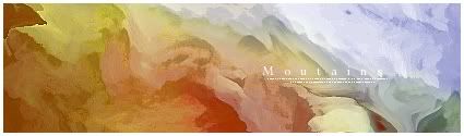
New one
And a tut ^^

i can't rip it? ;__;
now this one is muuuuuch better...
I likie the fact that this has more contrast than the other one... like the blue representing a sky and even a bit of green(ish) to the lower right which is kind of like grass... a great sig Polaris
=====>Check out my sigs!<=====
It's awsome to play aound with filters in GIMP! ^^ Takes a long while though!
---------------->
 Posting Permissions


 Reply With Quote