


*sigh* New year, new thread! The other had so many pages and I found better to start a new one ^^" Here are some of my latest banners!
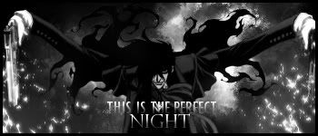
Hellsing version 1
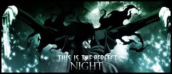
Hellsing version 2
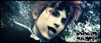
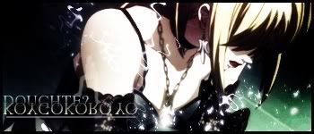
Misa Amane
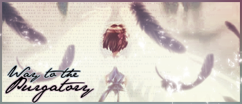
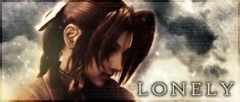
I made a tut with this one
If you wanna check it's here: Final Fantasy VII Anniversary by ~Adeselna on deviantART
What do you think?
Take care
~Polaris


 Reply With Quote