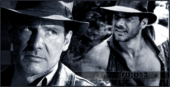
Hmmm, nice sigs even though the last one lacks alot of quality but it's good. The first two are cool but the colors of them are a bit over done, I mean I know that you wanted that colors over it but it is done bit too much, try to lower it. I don't know what it's called in GIMP but it's called 'Photo Filter' in Photoshop.
Anyway, the render is nice but I can't see that you did much work there I have this image and it is almost rendered in its self. The white edges around the angel needs to bee removed until then this could not be called a render, it hardly contain that much work.
But keep trying Polaris, I know you'll get there, dear.


 Reply With Quote


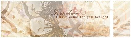


 and effects in both the sig and big one is amazing... some of your best Polaris
  , and the one with flowers had some fine blending in it