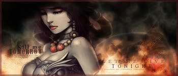
New one MU online


New one MU online
Good smudging.


Awesome BG! the smudging is great as well.
Awesome Polaris, just pure Awsome
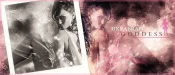
New one
I love her necklace ^^ It ended up so nice

I like it, though at first glance the smooth stock didn't quite work well with the relatively rough background. It might also be the difference in saturation between the two. I like your use of text, it's visible but always takes a back seat to the actual imagery. I really like the art by the way, what's it from?
You have some very nice work. Keep it up
Most are random images: check here Planet Renders v3 They have some pretty awsome renders
Ah ok, I'll give it a look. Thanks.
You've improved very much lately. Your smudging is getting really good, I like these three last sigs, their backgrounds are great.
Indeed, your text looks so simple and easy to read without it taking the glory of the image in focus.
I like to add that part of this improvement is the use of pictures that are high in quality. keep it up, try more styles.
I love the last one!
Current goal: learning drawingNext goal: SQL coding
mmm yea this latest stuff is great i like the MU one espically cause its has awosme blending ( me and my blending :rolleyes2 )
but what has really blown me away latley is the text, it looks so simple yet no one else could pull it off like you can do and have done!
I demand the psd for the mu one!
Make more sigs!
My thread
-3 time sigmaker challenge Winner
Too tall. Maximum signature height is 250px. Please read the Signature rules and feel free to PM a mod/admin if you do not understand them. -Rantzien
Don't worry! I'll make a tutorial of that style ^^
Idon'tneedaname requested a sig and I'm still working on it, however I tried a different style of colours and I fell in love with it! ^^
And also I made a new banner for my website!
I like the colours even though I think I'll change them soon
Nah nah nah, no need for a colour change, that looks great! ^^

you're quite good at this arent you xD
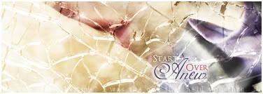
Just made these two for a request! Be honest
Btw I'm converting a lot of brushes these days for GIMP users who can't have GIMP 2.4!
Last edited by Polaris; 01-21-2008 at 01:05 PM.
Opps sorry double post hihihih I made a tutorial of this sig! Hope it helps people from GIMP and PS
ImageShack - Hosting :: khtutorialbypolaris2xy5.jpg
This was the outcome:
Good Luck!
Tinhas k por dps de mim keh po teu post ficar por cima do meu!
LOOL
NICE ONES, SIS!!!! Wonderful tut ^^
Working on it now
 Posting Permissions


 Reply With Quote