


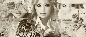
As usual I don't really have much to critique on yours. However,
this one seems a bit weaker than your usual work. The colored version is fine. But it looks like you merely gray-scaled/whatever this one without making the adjustments that are sometimes needed for these things. Namely it feels like you lost some of the depth/contrast in the conversion(which is normal for most of them that I have done that to) but didn't compensate for it.

 Reply With Quote