Page 1 of 2 12 LastLast
Results 1 to 15 of 16

Thread: School Graphic Design (Image Heavy)

  1. #1
    Quack Shlup's Avatar
    Join Date
    Aug 2000
    Location
    California
    Posts
    34,993
    Articles
    14
    Blog Entries
    37
    Contributions
    • Former Administrator
    • Former Cid's Knight

    Default School Graphic Design (Image Heavy)

    I teach math at a middle school, and recently the principal asked me to:

    1) design a new school logo
    2) re-design the website
    3) design new business cards
    4) design name tags
    5) design a new T-shirt

    So I'm working on that stuff, and I had some of it done and wanted some feedback. Any input would be valuable. :}

    FYI: Our school colors are blue and gold and the mascot is a cougar.

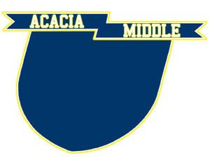
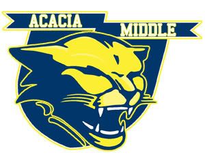
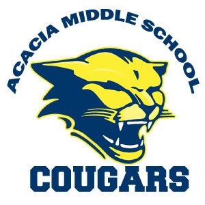
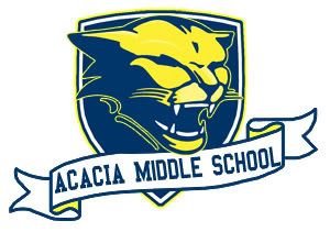
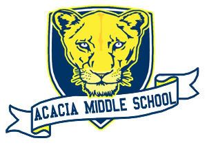
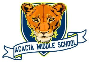
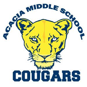
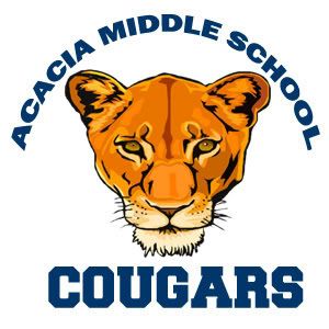
    Cougar Heads


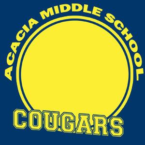
    Backgrounds


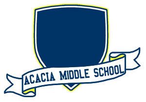
    Sample Combinations


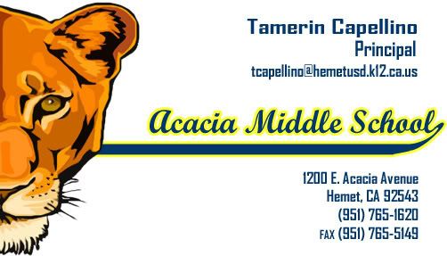
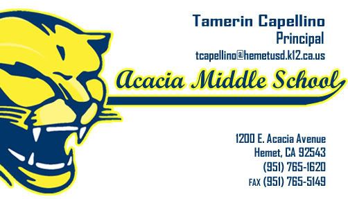
    Sample Business Cards


  2. #2
    I'm selling these fine leather jackets Aerith's Knight's Avatar
    Join Date
    Jul 2005
    Location
    The Netherlands
    Posts
    10,825
    Blog Entries
    1

    Default

    The first cougar head is definitely the most awsomesauce..

    hmm.. but i would choose the one that has no yellow in it, just blue and white.. simple and good.

    And i would pick the first of the business cards and the 4th of the sample combinations.


  3. #3
    Old school, like an old fool. Flying Mullet's Avatar
    Join Date
    Apr 2003
    Location
    Napping in a peach tree.
    Posts
    19,185
    Articles
    6
    Blog Entries
    7
    Contributions
    • Former Administrator
    • Former Cid's Knight
    • Former Senior Site Staff

    Default

    My picks:


    I like the inclusion of all school colors over the blue and white one. I think the shading of this image makes it look a lot nicer than the non-shaded version. The other two don't look very fierce, which is what school's are usually looking for in a mascot.


    I think this goes best with the mascot image I chose above. I don't like the first one because "school" is missing. I like having a white background and the scroll gives it an academic feel.


    Most business cards I've seen have the business(school in this case) on the top of the card with the person's name, contact info and such below. The other two cards seem cluttered.

    EDIT: If cost of printing is an issue, than I would go with the first mascot, the blue and white one. If costs aren't as much of an issue, go with the shaded blue and gold version.
    Figaro Castle

  4. #4
    I'm selling these fine leather jackets Aerith's Knight's Avatar
    Join Date
    Jul 2005
    Location
    The Netherlands
    Posts
    10,825
    Blog Entries
    1

    Default

    so mullet, if cost were an issue, then you picked the exact same ones as me..

    well.. at least the vote is still unanimous


  5. #5
    Quack Shlup's Avatar
    Join Date
    Aug 2000
    Location
    California
    Posts
    34,993
    Articles
    14
    Blog Entries
    37
    Contributions
    • Former Administrator
    • Former Cid's Knight

    Default

    You should see these business cards she gave me as examples--they're pretty much every special effect you can put in Photoshop. Gradient, drop shadows, beveling and embossing, stroke x 5. Ridiculous. I don't think cost of printing is an issue, but I when I sent them to her a minute ago I told her I was going to a clean look.

    Thanks for the feedback, guys! It's very useful since I can't get feedback from my co-workers yet.

  6. #6
    Polaris's Avatar
    Join Date
    Apr 2004
    Location
    Sunny Portugal
    Posts
    6,186
    Blog Entries
    1

    Default

    Yeah I'd also pick the ones Mullet did Did you draw the mascot of the logo yourself?
    Also for the business card they gave u with PS issues, don't worry is normal. From what I've seen it's all about special effect these days :rolleyes2

  7. #7
    Old school, like an old fool. Flying Mullet's Avatar
    Join Date
    Apr 2003
    Location
    Napping in a peach tree.
    Posts
    19,185
    Articles
    6
    Blog Entries
    7
    Contributions
    • Former Administrator
    • Former Cid's Knight
    • Former Senior Site Staff

    Default

    I know from a website design point of view I prefer clean, simple and professional looking designs, so I would loathe business cards where they put everything in just because they can. People forget what the purpose of a website(or business card) is and they get side-tracked by all the pretty eye candy.
    Figaro Castle

  8. #8
    Quack Shlup's Avatar
    Join Date
    Aug 2000
    Location
    California
    Posts
    34,993
    Articles
    14
    Blog Entries
    37
    Contributions
    • Former Administrator
    • Former Cid's Knight

    Default

    The cougar head is based on a couple of them I found while browsing around. I did draw it, but it's more on the stolen side than the original side. In the teacher profession you can hear almost daily "Don't re-invent the wheel." xD

  9. #9
    I'm selling these fine leather jackets Aerith's Knight's Avatar
    Join Date
    Jul 2005
    Location
    The Netherlands
    Posts
    10,825
    Blog Entries
    1

    Default

    I dont really like more then one colour on a business card, It should be simple and easily readible..

    a banner can have yellow in it though.


  10. #10
    Quack Shlup's Avatar
    Join Date
    Aug 2000
    Location
    California
    Posts
    34,993
    Articles
    14
    Blog Entries
    37
    Contributions
    • Former Administrator
    • Former Cid's Knight

    Default

    She wants a more colorful business card. The current ones are two-toned and she hates them.

  11. #11
    Draw the Drapes Recognized Member rubah's Avatar
    Join Date
    Dec 2004
    Location
    Now Destiny is done.
    Posts
    30,653
    Blog Entries
    21
    Contributions
    • Former Administrator
    • Former Cid's Knight

    Default

    I like the blue and yellow ones, ie what mullet picked

  12. #12
    What the bliff Recognized Member
    Join Date
    Oct 2005
    Posts
    17,343
    Blog Entries
    2
    Contributions
    • Former Cid's Knight

    Default

    Head - # 3 looks the best as a logo imo...the last two are kinda big
    Backgrounds - # 1 and 2 are cool
    Combos - # 1 and 2 (2 I could see used for t-shirts)
    Cards - # 1 looks the best definitely

  13. #13
    <3 Recognized Member Jess's Avatar
    Join Date
    Aug 2002
    Posts
    7,337
    Contributions
    • Hosted the Ciddies

    Default

    Quote Originally Posted by Professor Plum View Post
    I really like this.

  14. #14
    Free-range Human Recognized Member Lawr's Avatar
    Join Date
    Jul 2005
    Location
    right here-ish
    Posts
    5,000
    Contributions
    • Former Site Staff

    Default


    Two toned is just boring. Our school mascot is a shamrock, and the colors are Green and White, but you can always add in some Black when you have white. ;O


    This one matches the above picture.
    I also like your little caterpillars.
    placeholder_text.jpeg

  15. #15
    The Anti Mosher Balzac's Avatar
    Join Date
    Feb 2008
    Location
    Hangcaster, England
    Posts
    1,534
    Blog Entries
    1

    Default


    Look great!

    If they are for print, people tend to stay to two or three colours. It's more cost effective and looks nicer on the whole.
    You hold my heart in your manly hands I wanna feel the throb of your handsome gland. I wanna hold you tight like a newborn kitten, against my flesh like a cashmere mitten. Tickly tick, I'm makin' skin bump heaven and all the way down it's lookin' cleanly shaven. Prickety pricks, it's stubble on stubble I better slow down or I'm in real trouble. Want you, touch you, feel you, taste you! Knick knack whacky whack 'till I see the man stew. spin you around let me see that hole! I'm a tunnelin' in a like a short hair mole. Once I'm inside I'm gonna leave a trace, half in there and half on that face! One finger, two finger, there fingers gone! Mano a mano I love you John!

Posting Permissions

  • You may not post new threads
  • You may not post replies
  • You may not post attachments
  • You may not edit your posts
  •