Results 1 to 6 of 6

Thread: Kanshisha's Sigs!

  1. #1
    I'm Back~! Kanshisha's Avatar
    Join Date
    Dec 2006
    Location
    Australia
    Posts
    1,697

    Default Kanshisha's Sigs!

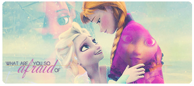
    Hello all, Its been a while since i've made sigs for public viewing.. so im a bit rusty. I dont really know this month or season's current style.. but here are some sigs that i have just done!


    I used the same pic, but just different sides of the sig. the bottom one seems softer than the top... for me, i liked the top's colour and effects. But i also like the smoothness of the last sig. Well up to you guys! I am still a bit rusty, and i need to dl so many more pics and C4D's
    Please Comment! Hints and Tips are welcome ^^

  2. #2
    -=Hentai School Girl=- Fuzakeru's Avatar
    Join Date
    Jun 2003
    Location
    i liek leve in huose
    Posts
    2,644

    Default

    The colors are really neat on the first one! I like the sea greens and blues with the yellow. I think some of the lines going in to his hair would be fine but I'd suggest taking the eraser and trying to keep the graphics from off of your render's face. It covers up his sexiness and you know how rabid fangirls hate filtering sexiness. You don't wanna piss the fangirls off now, do you?

    I like your choice of border on the second one. n_n Unique borders can add so much to a banner! I can't say I'm too hip on the font choice. Maybe if the quote was a little smaller and not right dab in the middle of the right side.

    Oh! And other people do it different but something to think about when you play with typography - you should think of contrast as your friend. In your second sig I like that you bolded his name because it does contrast with the normal thickness of the quote but its so simliar that its barely noticeable. Next time you do a quote try using something easily readable for a group of words and have fun with the person's name! Use cursive or something outlandish to spark the eye's interest. I don't know if that makes sense or not but it was something I just learned in my studies.

    These are great warm ups! Please share more with us! ( Hope you didn't mind my rambling. )
    Do you Wanna Build a Snowman?

    -= It doesn't have to be a snowman... =-

  3. #3
    I'm Back~! Kanshisha's Avatar
    Join Date
    Dec 2006
    Location
    Australia
    Posts
    1,697

    Default

    thanks for the comments! ^^

    Next time the sexiness will prevail. x3

    I understand your comment about the texts. I should really download some more :/ but 'eh.. Next time i will place the name and quote/s more strategically. These comments will improve me in the future, thanks you..

    (more sigs to come thanks for viewing)

  4. #4

    Default

    Good but you can make better ive seen it in the past.

    Get to it Squall!
    My thread http://forums.eyesonff.com/showthread.php?t=91051
    -3 time sigmaker challenge Winner


    Too tall. Maximum signature height is 250px. Please read the Signature rules and feel free to PM a mod/admin if you do not understand them. -Rantzien

  5. #5
    I'm Back~! Kanshisha's Avatar
    Join Date
    Dec 2006
    Location
    Australia
    Posts
    1,697

    Default

    hehe, nice to see you again NaroK! long time no see.

    Here's my lastest sigs:


    That's right! a different size I've recently found out that i've been sexist on most of my work, the fact of me doing my sigs on mostly guys. So i thought i'd make a sig of a girl! well, aerith / aeris was the first to come in mind.


    this took me like 30+ mins to make. the bg was a tough one. I tried to make it strong, yet soft at the same time. If your thinking " wtf? why is squall in a tilt? " well the answer is because he's in a running motion! I hope this made a better impression of my skills than the last two sigs ==''

    I took Fuzakeru's tip with the text work. Well, just to say, omg you so helped me lols. well thanks for the view, please comment! hints and tips welcome!

    See you guys later~ Kan'

  6. #6
    Recognized Member G13's Avatar
    Join Date
    May 2006
    Posts
    5,768
    Blog Entries
    10
    Contributions
    • Former Cid's Knight
    • Hosted the Ciddies

    Default

    I really like how you have the characters positioned in them. Very nice. Two thumbs up!

Posting Permissions

  • You may not post new threads
  • You may not post replies
  • You may not post attachments
  • You may not edit your posts
  •