-
-


Originally Posted by
oblivion161

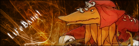
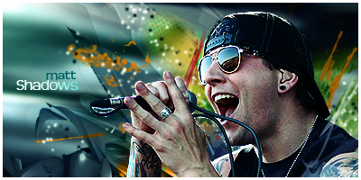
I really like this one! Just the way you have the background as the angle of the lines and colors seem to be flowing away from the main picture. It brings attention to the guy.
BUT that's another thing, it brings attention to the guy. He seems a little out of place with those colors. I dunno how you'd fix that but he seems too real with the fake colors xD
I love it though! Better than I could do :P
-
That's what I thought too when I was making that sig xD Some of the colors seemed out of place when I was making it. But then when I tried deleting some of the colors, it just made the sig look worse, so I decided to just leave them in there o.o
-
-
-
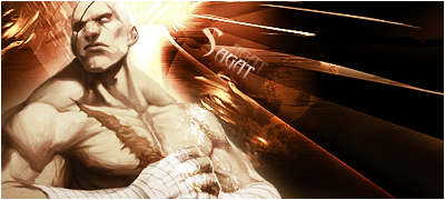
Yeah I see people are talking about the sharpening. If you don't like that sharpened look, you can go to Filter > Noise > Reduce Noise and get a nice clear image (be careful with the settings) and without those artifacts.
Really good use of C4D's and fonts! 
 Posting Permissions
- You may not post new threads
- You may not post replies
- You may not post attachments
- You may not edit your posts
-
Forum Rules


 Reply With Quote