Originally Posted by black orb

...

...


That's just badass.
My favorite from that link:


wtf is this
my perception of Pac-Man is now ruined

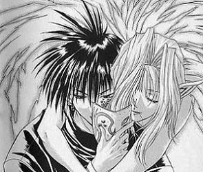
What??? That Pac Man boxart is smurfing awesome!!!!!! Same with the Donkey Kong ones and those two really creepy monster ones just posted.
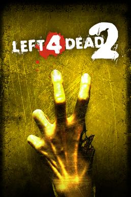
What I don't get is why the L4D2 boxart is so bad. Sure it's kind of boring, but ... ?
It's meant to be the other way around. It got censored because two fingers up with their backs facing is an offensive sign, so the art was reversed. Personally,I think the European cover looks better than the American anywayOn second thoughts, the original version looks a bit better
Last edited by I Don't Need A Name; 12-02-2009 at 06:49 PM.
>>> The guy who drew the non-anime art was very faithful to the original character design, is not bad at all is just a different style.
>> The black orb glitters ominously... but nothing happens..
My Eyes My Eyes!
It's only fair that Europe gets prettier box art than North America! You guys get so much that we miss out on - plus the games are released earlier in NA!
If that's true then why don't I have the Trace Memory sequel ;_;
The artwork isn't poorly made, no, but I do prefer both the style and atmosphere of the first. THe second just screams "OMG BUY ME CAUSE IM smurfING HARDCORE FIGHTER YO".
everything is wrapped in gray
i'm focusing on your image
can you hear me in the void?
I like the American L4D2 box art better, and Ive never heard of holding fingers like that meant something offensive *cough*retarded*cough*
It was around a long time before your middle finger equivalent.

Also, the L4D2 box art was included for good box at, not bad box art. The page includes good and bad and that cover is classified as good.
There were a lot of ugly boxart back in the day. I don't understand either why an old hillbilly stereotype is on the front of a sci-fi shooter.
 Posting Permissions


 Reply With Quote