
Originally Posted by eternal essence

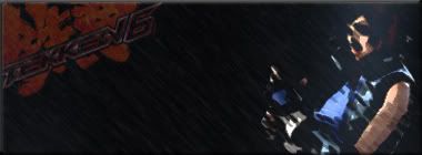
I'm automatically a fan 'cause you made a Tekken 6 sig. Your work looks nice to me, so this was an added bonus. King has been my main since the first Tekken.
Nice work!


I'm automatically a fan 'cause you made a Tekken 6 sig. Your work looks nice to me, so this was an added bonus. King has been my main since the first Tekken.
Nice work!
Dude make more sigs.
placeholder_text.jpeg
As you wish ^^
I like~
Eyyyyyyyyyyyyy
Thank you muchly
Your new sig is my favourite one.


please make sigs again! sigs need to make a comeback! >.<
I already have the idea for my next set, so I'll get started on that when I get back from my vacation.
Never has the title of this thread been more appropriate
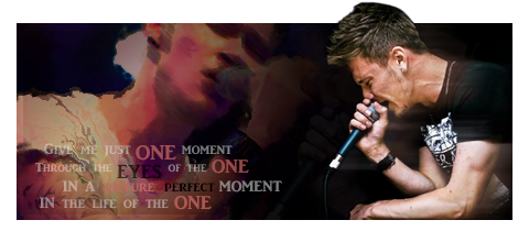
Here's a newbie.
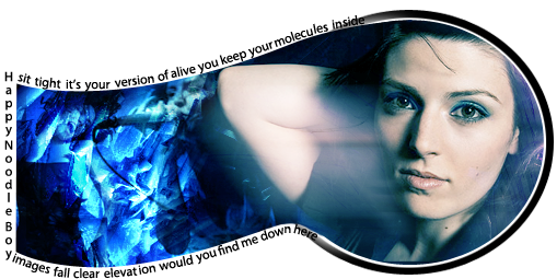
At first my post started out simple but then all of a sudden I found myself with like three paragraphs so forgive me! :aimdumb:
I can't believe I didn't say anything about this one yet though. You did a nice job with the border! I know a lot of work goes into that kind of transparency and sometimes details like those go unnoticed to the general public but good job good job good job.
Maybe you already know this but a filter I like using on people (especially after I transform and shrink them) is Filter > Noise > Reduce Noise to make them look crisp and keep a lot of details. I keep the Strength at 10, Preserve Details at 100%, Reduce Color Noise at 0% always and just work with the Sharpen Details slider. It'll make the renders pop out a lot more and look sharp as long as you don't overdo it. Sometimes toggling the preview button on and off with the original file visible in the background helps too.
This step is completely unnecessary sometimes but after sharpening the render I duplicate the same layer and set the Blending Option to maybe Soft Light or Overlay and reduce the opacity. There's great individuality with the opacity depending on the overall colors in the render, even with something as simple as the person's race or the color of their clothes.
The text is good but sometimes putting a 0px Size and 1px Distance drop shadow on text (with another color sometimes, not just black) can help it blend better with the rest of the image, or make it more legible. You did a good job though, I know it can be tricky trying to make that much text work with the image.
I give you a lot of props because generally your signatures are a lot larger than what I create, so you've gotta heavy burden making all that real estate appealing to the eye!
And cutting out hair is hell on Earth isn't it?
placeholder_text.jpeg
Is that Justin Beiber?

Thanks Lawr. You've given me that advice about noise reduce before but it's just something I'm not used to doing so I'll just have to make myself remember next time and see the results. The sig itself is definitely too big. And I didn't notice that it was going to be too big until I was about 3/4 of the way done, and by that time laziness overtook perfection. That black space in the middle between the stock and the background image irks me and there's too much room between the text and the top left of the sig imo. All that said I'm still pretty happy with it and I wasn't expecting too much considering I haven't made a sig in so long.
Thanks for all the advice and kind words though!
TB, I will straight up murder you.
 Posting Permissions

 Reply With Quote


