Page 1 of 3 123 LastLast
Results 1 to 15 of 42

Thread: First sig I've done in a while

  1. #1
    Actual cannibal Pheesh's Avatar
    Join Date
    Apr 2004
    Location
    'Straya
    Posts
    8,371
    Articles
    4
    Blog Entries
    5

    Default First sig I've done in a while

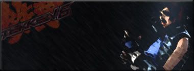
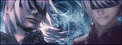
    So I started getting back into Photoshop again (my old web graphic job pretty much destroyed any of the fun I used to find in it), and the result was a lot better than what I used to do. So here it is:


    My only concern is that it's a little bit busy (which is why I left an absence of any writing). But I was having fun rediscovering some old brushes and filters, and even more fun learning some new ones. So the end result may be a bit cluttered, but overall I like.

    Thoughts, comments or constructive criticism is welcome.

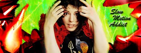
    EDIT: Here is a new one:

    Last edited by Pheesh; 02-23-2010 at 10:59 AM.

  2. #2
    I'm Back~! Kanshisha's Avatar
    Join Date
    Dec 2006
    Location
    Australia
    Posts
    1,697

    Default

    Not so bad for a "get back into it" set of sigs
    You made the right choice for the top one. Having writing placed onto it would overload the sig. The sizes for your sigs are good for what you are doing.

    I hope to see more of your work. Good work and keep at it.

  3. #3
    Actual cannibal Pheesh's Avatar
    Join Date
    Apr 2004
    Location
    'Straya
    Posts
    8,371
    Articles
    4
    Blog Entries
    5

    Default

    Yeah, I much prefer small, thin sigs, they're just more aesthetically pleasing to me. The exception obviously being the sig I use...but I like that one for other reasons. XD

  4. #4
    Actual cannibal Pheesh's Avatar
    Join Date
    Apr 2004
    Location
    'Straya
    Posts
    8,371
    Articles
    4
    Blog Entries
    5

    Default

    Hey all, I'm actually looking for some help with this next one. I'm very happy with how it turned out, although I'm still up in the air about the bevelled edge as a border. It definitely worked better than any form of strokes that I used, but I might think of something better for it later.


    Comments and ideas for improvement would be appreciated.

  5. #5
    Some kind of Nature~ Fonzie's Avatar
    Join Date
    Jun 2005
    Posts
    6,078
    Contributions
    • Former Site Staff

    Default

    Hmm, which edition of photoshop do you use?

  6. #6
    Actual cannibal Pheesh's Avatar
    Join Date
    Apr 2004
    Location
    'Straya
    Posts
    8,371
    Articles
    4
    Blog Entries
    5

    Default

    CS3

  7. #7
    Some kind of Nature~ Fonzie's Avatar
    Join Date
    Jun 2005
    Posts
    6,078
    Contributions
    • Former Site Staff

    Default

    Hmm, I don't see why you want your focal point so blurry and distorted. It seems a little on the boring side as well colour-wise.

    Good start though.

  8. #8
    Actual cannibal Pheesh's Avatar
    Join Date
    Apr 2004
    Location
    'Straya
    Posts
    8,371
    Articles
    4
    Blog Entries
    5

    Default

    Ah k, noted. It was more about trying to get the effect to look like the image of asuka was fully blended in with the background, it worked well except for the hands.

    I'll make my next one colourful though. ;D

  9. #9
    Some kind of Nature~ Fonzie's Avatar
    Join Date
    Jun 2005
    Posts
    6,078
    Contributions
    • Former Site Staff

    Default

    Quote Originally Posted by eternal essence View Post
    Ah k, noted. It was more about trying to get the effect to look like the image of asuka was fully blended in with the background, it worked well except for the hands.

    I'll make my next one colourful though. ;D
    Well, you want your render to pop-out, so to speak, a little bit. If anything you over blended it into the background. Do you use gradient filters?

  10. #10
    Actual cannibal Pheesh's Avatar
    Join Date
    Apr 2004
    Location
    'Straya
    Posts
    8,371
    Articles
    4
    Blog Entries
    5

    Default

    Yeah, normally I will have a set render in the sig that I will have in the foreground, the above sig was an exception to rule purely to try something different.

    Well I didn't use any on that sig, I actually rarely use a gradient filter, except for when I used to work with photos. The above sig mainly has some guassian and motion blur, and smudge stick. The rest was done with blending effects.

  11. #11
    Some kind of Nature~ Fonzie's Avatar
    Join Date
    Jun 2005
    Posts
    6,078
    Contributions
    • Former Site Staff

    Default

    Quote Originally Posted by eternal essence View Post
    Yeah, normally I will have a set render in the sig that I will have in the foreground, the above sig was an exception to rule purely to try something different.

    Well I didn't use any on that sig, I actually rarely use a gradient filter, except for when I used to work with photos. The above sig mainly has some guassian and motion blur, and smudge stick. The rest was done with blending effects.
    Usually the background is smudged, not so much the render. Also, try using more gradient filters along with differing opacities. Screen setting is also always good to use.

  12. #12
    Actual cannibal Pheesh's Avatar
    Join Date
    Apr 2004
    Location
    'Straya
    Posts
    8,371
    Articles
    4
    Blog Entries
    5

    Default

    I'm so proud of my boys atm, so I made a sig in commemoration ^_^


    And here is a new one that I did just because she's gorgeous.


    Speaking of gorgeous....


    Last edited by Pheesh; 08-25-2011 at 01:44 PM.

  13. #13
    Free-range Human Recognized Member Lawr's Avatar
    Join Date
    Jul 2005
    Location
    right here-ish
    Posts
    5,000
    Contributions
    • Former Site Staff

    Default

    These are really good, Mr. Gir!

    I tried changing the stroke to white just to see what it'd look like...


    This one looks nice but I think the girl could use more emphasis. I'd go with Filter > Noise > Reduce Noise to get a really clear picture (like, all-the-details-in-her-eye-lashes clear) and then using soft light for more color contrast.


    Good stuff ee. I like your backgrounds.
    One thing I suggest though is that you save your images as PNG instead of JPG so you don't have artifacts all over your sigs!
    placeholder_text.jpeg

  14. #14
    Actual cannibal Pheesh's Avatar
    Join Date
    Apr 2004
    Location
    'Straya
    Posts
    8,371
    Articles
    4
    Blog Entries
    5

    Default

    Thank you for the tips (:

    I'll try to give them all a shot, and I always figured that JPG wasn't the best format to be saving my images in, but it was just a case of "go with what you know". I'll save them as PNG in future.

  15. #15

Posting Permissions

  • You may not post new threads
  • You may not post replies
  • You may not post attachments
  • You may not edit your posts
  •