I say keep it.


I say keep it.
Proud to be the Unofficial Secret Illegal Enforcer of Eyes on Final Fantasy!
When I grow up, I want to go toBovineTrump University! - Ralph Wiggum


It was getting a bit old but i'll look back in happiness at the days i would sit and click on Mr graves attack button laughing mwahahaha.....*walks away in shame*

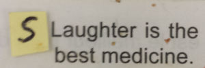
The text of the icons don't lie on the same pixel line.
*shrugs*
I hope not too many people care, because image editing != my forte.
no objection here
I think this should do it; I've only moved the text up two pixels, but I think that's enough...
And here's where I'll stay / For ten years and a day
We're on a quest to find hidden treasure / And mystery on The Wild Sea
done
I swear the text is in exactly the same place as before, and ai KNOW I moved it upwards
EDIT: I fyou look really closely, none of the text is really in line on ANY of the images XD
And here's where I'll stay / For ten years and a day
We're on a quest to find hidden treasure / And mystery on The Wild Sea
The text should be lined up with the rest of the text in the other icons. The pictures don't matter. I can't even tell the difference though. It's just a couple pixels.
no, the text is in the images right? None of the text is lined up anyway, let alone the images.; they're all off =P
And here's where I'll stay / For ten years and a day
We're on a quest to find hidden treasure / And mystery on The Wild Sea
You guys are hilarious.
Proud to be the Unofficial Secret Illegal Enforcer of Eyes on Final Fantasy!
When I grow up, I want to go toBovineTrump University! - Ralph Wiggum
You're using the wrong kind of font anyways.

I say impact is a must.
MR. SATURN FONT!
Earthbound font only works if you have that font installed on your PC, which I doubt most people haveOriginally posted by Doomgaze
MR. SATURN FONT!I do though

 Posting Permissions