myy paintshop pro trial finished ages ago


myy paintshop pro trial finished ages ago
WEEEEEEEEEEE!!!!!!! I <3 Bou I miss you...


Another tip would be that if you really want to use 'net images, find the full sized ones that are't too small. When you enlarge images on paint, it makes it really blocky.
Just a tip, don't get all mad about me being mean cuz I'm just trying to help
Yes I'm sorry if I sounded mean, I was just trying to get some genuin critisism out, but probably didn't come out right.
Just try not to leave as many gaps, getting some high resolutioned pictures to put on, and maybe spice up the text a little bit (just muck around with different fonts and try putting drop shadows on it, which can be done in paint).
Practice is the key. =)
"... and so I close, realizing that perhaps the ending has not yet been written."

http://www.gimp.org/
Free and good graphics program.
everything is wrapped in gray
i'm focusing on your image
can you hear me in the void?
Actually, There not that bad for paint. Paint it just quite possibly the worst program for graphic design. Although I am pretty sure almost everyone starts out with paint -- But you can still do some nice pieces. Better quality pictures would make your signatures look alot better. Pixelatedness = bad. You could also try some prettie fonts to make the sig look more interesting and nice fonts can make the signature go together better.
As others have said, I highly recommend you try out some other programs. I think Photoshop is the best, even though I am such a n00b with Photoshop. But I have found some other programs that work well too.
Anyways, nice job with your signatures Kathryn! =)
I can't really say they're good even for paint. Even if the program used for doing it isn't the best, there are some basic guidelines you need to follow when designing a sig.
First, it's a signature, not a desktop background. Signatures are meant to be small.
Try a one coloured background with a thin border around the sig, then put the contents inside that. Don't fill it up with as many pictures as possible, Try one or two, then add the text (if any) somewhere it's easy to read it.
It's not easy doing all that in paint though, but it can be done, I've seen several examples. Anyway, screw paint, get that program I linked to in my previous post. It's free, and it's "almost" Photoshop. I personally prefer Photoshop over the GIMP, but the GIMP is easier to get, smaller, and 100% free.
everything is wrapped in gray
i'm focusing on your image
can you hear me in the void?
It's sarcasum Mirage...Originally Posted by Mirage
nik, you have been asked the stop once already. This is twice. If you post in this thread again, I like you, but I wont hesitate to ban you. There's no reason for your rude comments to continue after being asked to stop the first time.
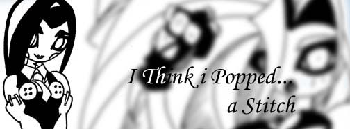
here are some new ones and I used paintshop pro
Last edited by Kathryn; 03-02-2005 at 04:49 AM.
WEEEEEEEEEEE!!!!!!! I <3 Bou I miss you...
Those are pretty good, Kathryn. I think its important that you don't distort the image when you resize it though. Like on those two, they look squished because you made them shorter without making them thinner.
And they're too big for EoFF. Not that you're using them here anyway.

You're definitely improving, and remember, everyone has to start somewhere. My signatures used to be absolutely terrible (in terms of photoshop skills, not taste), but I think I've improved a little over the years.
Download some tutorials and keep making signatures, and I'm sure your pictures will improve tenfold.
"As the days go by, we face the increasing inevitability that we are alone in a godless,
uninhabited, hostile and meaningless universe. Still, you've got to laugh, haven't you?"
If someone wants to say something bad, then dont bother saying it at all. It's no help and can only cause upset. saying "i dont like them" isnt constructive and it isnt crit. Instead say "they arent my taste, but i like what you did with..."thats constructive.
I think it's great your posting and sharing them, as Rainecloud said, everyone starts somewhere. My advice would be to save someones existing Signiture, then erase everything on it in your picture program, so you have a black canvas thats the right size. Then put your stuff in that canvas, just like having to draw within a box, it will help you hone your skills.
here is another one
(note:it isn't good though)
WEEEEEEEEEEE!!!!!!! I <3 Bou I miss you...
Constructive doesn't mean only saying the nicest things possible about someones work. I agree to the extent that it is wrong for people to be sarcastic and simply say "It's crap" without exactly explaining how it could be fixed...
But you also need to understand, saying the bad things about it, can improve it. Already, we can see Kathryn has imrpoved quite a bit, and I think they are coming along great. =) If someone were to say only nice things about someones skills, then the person will never imrpove. =\
Well it's a bit jumbled, but you get the gist of what I mean... Good work Kathryn. ^^
"... and so I close, realizing that perhaps the ending has not yet been written."
Just as constructive as saying, "They aren't my taste, especially this area, you could maybe try doing _____ instead." Pointing out the weaknesses in something isn't a bad thing; it helps us to improve.If someone wants to say something bad, then dont bother saying it at all. It's no help and can only cause upset. saying "i dont like them" isnt constructive and it isnt crit. Instead say "they arent my taste, but i like what you did with..."thats constructive.
So here I go...
1. The image quality is poor, use GIF instead.
2. You should maintain the same ratio when resizing so that you do not distort the image. For exaple, if the image is 100x400 to begin with, don't resize it to 50x79... you could 10x40, or 50x200, or 150x600 etc.
3. Try using a smaller canvas size. Like 400x120 or 290x100
4. Get a program other that MSPaint.Paintshop Pro, Photoshop, anything. :P
5. DL lots of cool brushes, fonts etc!
6. Layers are your friend.
7. Practice... look at other people's sigs and figure out what you like, and what you don't like.
FFVII Analysis... SEXIFIED! :O
I love my Squall of SeeD / Squall / Glenn / Belle-Bambi / Glennevieve / Bishie / Mr. Scientist Man / Duck-Lover / Geeky Boi / Okies with all my heart.
 Posting Permissions


 Reply With Quote