WOW, that was your first try? Cool.


WOW, that was your first try? Cool.
these are my newest attempts, what do yas reckon of these ?


I think they're kinda' big, but better then anything I can do

Uhm, I dunno. They are a bit big, but the thing that spoils them the most is the font, it doesnt' seem the right type of font. It all seems a bit random as well, the way the colours are thrown together with the pictures. The big open spaces with nothing in them are also a bit random. But, considering you're new to making sigs, they're good efforts. Just keep practicing and you'll get better :}
allot of ppl keep sayin there big, ill try nd make sum smaller 1's, the open spaces were for more text but i cudnt really think of ne thin good 2 put in, oh and with regards to the fonts, i know im trying 2 download sum font packs but i cant find ne
I dont want to sound mean or anything, but I really dont like the boarders, never really did like those big fancy, winamp skin type boarders, the rest looks good though.

The only thing I don't like is the bevel and emboss being used on EVERYTHING. I use that on borders and text, but the characters look better on a nice brush background or blended. Your second attempt with the turks looks much nicer as far at that goes. I would also try pulling colors out of the pictures, like the turks sig would look better with a red theme rather than a blue theme. Otherwise, they're very good. Much better than my first attempts.A good place to get fonts is www.dafont.com.

thanx allot for all your feedback and advice, it's been very helpfull, especially those new fonts
oh and khaotic would u mind telling me how u managed to make that square effect in your sig background ?
thanx
what do u meen ?Originally Posted by Starry Relm
In other words, picking colors that are actually in the pictures to use for text, backgrounds, and borders. Sorry, should've been more specific.
iv tryed 2 take into acout what yas have sed and these r my latest works


oh and this is probly gunna make me sound like an idiot but, can ne1 tell me how to get rid of the white under my "reno" sig i wanted it to look as tho he was'nt realy part of the sig, just sitting on it
you ppl probly have no idea what im going on about but....
Last edited by ultima88; 07-20-2005 at 01:45 AM.
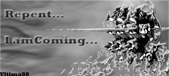
tifa againlol

Last edited by ultima88; 07-21-2005 at 05:16 PM.
This is fantastic!!!!
Put colour in your life
Put Princess Yuna
Try using the Magic Eraser tool, it removes a specific background from the picture that's all the same colour. Say if the whole background was white, and you had a picture in the middle with a black border, and you used the magic eraser it removes the whole background so you only have the picture in the middle, Although I'm not sure if you need the background to be transparent if that's the case then you may need to recreate the sig (to get the magic eraser if you use photoshop, right click the eraser button and choose magic eraser).
You should also try and not use the whole 550x250 as some people like to put text underneath them, if the sig takes up the whole requirements they'll get taken off. Try using more of "400x150 or 450x150" they're not too small and not too big, plus the bigger sigs that have more graphics creation in them tend to be over 50kb if they're above 500x200px size. If you use simple pictures the filesize wont be a problem, but if you use fancy effects such as gradients, layers, borders, picture effects, you'll most likely have to resize the picture.
You need to read the requirements of signature making here and your sig has been removed because it is over the limit of 50Kb. You'll need to try and sort out how you do your sigs because if you continually try to use a sig over the limits you'll have your rights taken away from you. And then you wont be able to use a sig at all.
I'll figure it out later...
the problem is the backgroud is allready transparent
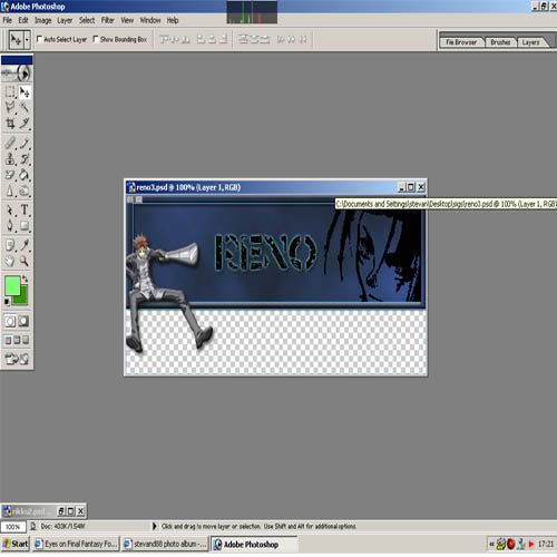
but when i save it it comes out like this

with white at the bottom
do u know how to correct this ?
oh and btw you all have been very helpfull and do u think me sig is an ok size now, or shud it be smaller ?
Last edited by ultima88; 07-21-2005 at 05:26 PM.
 Posting Permissions


 Reply With Quote