Page 1 of 2 12 LastLast
Results 1 to 15 of 24

Thread: critisism please

  1. #1
    The Nerd Who Knows Pant Leg Eater from the Bad World's Avatar
    Join Date
    Jul 2005
    Location
    Somewhere New
    Posts
    3,089
    Blog Entries
    3

    Default critisism please

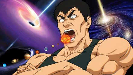
    here is an animation I made and a picture I drew. mostly I just want some critisism on the picture, and am putting the animation up for your amusement. please, critisism wont hurt me (unless its mean critisism). Their was alot of color loss with the dragon because its not the original, the original is 1.24megs, so it was too big.
    Attached Images Attached Images

    <PaperStar> live fast, die young, bad plefs do it well

  2. #2
    Make love not lust Yew-Yevon's Avatar
    Join Date
    Mar 2005
    Location
    R'lyeh
    Posts
    2,213

    Default

    thats a very nice dragon. as for the animation...I couldn't read it fast enof.

  3. #3

    Default

    Crappy drawings on the animation. The animation works fairly well, though.

    Yeah . . . and . . . nice dragon.

  4. #4
    The Nerd Who Knows Pant Leg Eater from the Bad World's Avatar
    Join Date
    Jul 2005
    Location
    Somewhere New
    Posts
    3,089
    Blog Entries
    3

    Default

    yeah, the animation drawing was crappy, but thats cause I didnt take my time. I like drawing crappy stick figures anyways. for the most part, they just say blah.

    The dragon I was kinda dissapointed in because the color cam out so bad in it. Im gonna try and make a link to it somewhere so you can see the original, I took out a lot of eraser marks using microsoft paint.

    <PaperStar> live fast, die young, bad plefs do it well

  5. #5

  6. #6
    The Nerd Who Knows Pant Leg Eater from the Bad World's Avatar
    Join Date
    Jul 2005
    Location
    Somewhere New
    Posts
    3,089
    Blog Entries
    3

    Default

    better looking dragon pics can be seen here. the white ones are the originals, there is two because one is bitmap and the other is gif.

    http://notsoknown.tripod.com/stuff/
    I hatew tripod

    <PaperStar> live fast, die young, bad plefs do it well

  7. #7

    Default

    Alright, first things first. The animation. Are you trying to be funny or something? Because It hasn't worked. Quite apart from being terrible picture quality, the animation is worse than being stabbed in the eye with a fork.

    But now that we've got the tripe out of the way. The dragon, whilst it may be at least temporarily pleasing to the eye, after looking at it for more than two seconds I can see some pretty basic cock-ups. The quality of the colouring is very poor, the tone is varied, from way too much to, barely covering. Also, the lack of ANY different colours makes me wonder if you were even trying when you made this. The next pretty major cock-up is a pretty major one indeed. IF YOU ARE GOING TO DRAW SOMETHING REALISTIC, LEARN HOW TO JUDGE SIZE AND ANGLE. 1) The horns, you can see that they are at an angle such that you can see both of them at the same time, and yet, when you look at the rest of the image, you can see that it is very much side facing. Unless we are to believe that you intentionally drew an injured dragon, there's something to spend your time on improving. 2) The scales, are inconsistent and rushed, I mean I can see more white spots around here than in the entire image.

    Put simply, If you want to get anywhere, try spending a little more time on your drawings than you do uploading it to EoFF.

    This was a bit overly critical, but you get the point.

  8. #8

    Default

    Good lord. Tempramental much? ;P They're not THAT bad. On the animation though, I dunno what program you used, but there should be a way to specify how long each frame lasts. It looks like they're set to some sort of minimum. I'd make 'em at least 1/2 a second per frame.


  9. #9
    The Nerd Who Knows Pant Leg Eater from the Bad World's Avatar
    Join Date
    Jul 2005
    Location
    Somewhere New
    Posts
    3,089
    Blog Entries
    3

    Default

    First, I take that crack about my animation personally insulting.
    Second of all, thank you for your critisism Master Quan. you have brought some major errors to my attention. it never even occured to me that the horns were to far apart, thank you.
    I have an explaination for the coloring, im not very good with sharpies. I should have used colored pencils for the color.
    The lack of colors was intentional, being as it was meant to be a RED dragon.
    I tried to take my time on the scales. the scales alone took me a good 45 minutes. I have to say, I did take my time on this drawing.


    EDIT: oops, I missed you Vyk. yeah there is a way to control the frame delays, but I decided against it. it is my first animation using that program and I wasnt too sure what I was doing at the time.

    <PaperStar> live fast, die young, bad plefs do it well

  10. #10

    Default

    I thought it was alright. I don't understand how you guys can just beat him down with those mean comments and not say anything to the other people who are just as worse as him (no offense ibcrayz). it saddens me a bit.
    What's a jellicle cat?

  11. #11
    The Nerd Who Knows Pant Leg Eater from the Bad World's Avatar
    Join Date
    Jul 2005
    Location
    Somewhere New
    Posts
    3,089
    Blog Entries
    3

    Default

    its alright, I know I suck, why do you think I asked for the critisism.

    <PaperStar> live fast, die young, bad plefs do it well

  12. #12
    programmed by NASIR Recognized Member black orb's Avatar
    Join Date
    Aug 2000
    Location
    RIP Chavez 1954-2013
    Posts
    7,613
    Blog Entries
    1
    Contributions
    • Banner Design
    • Logo Design

    Default

    >>> That dragon is bad-ass, I think it would look great printed in a black t-shirt.
    >> The black orb glitters ominously... but nothing happens..

  13. #13
    Enjoy The Silence FallenSilence's Avatar
    Join Date
    Mar 2004
    Location
    England
    Posts
    720

    Default

    Ignore the overly harsh comments, dude. I like your stuff. The dragon's really cool. Like Vyk said, if you slowed the animation down, it may improve it.
    Should've Done Something
    But I've Done It Enough
    By The Way Your Hands Were Shaking
    Rather Waste My Time With You

    Should've Said Something
    But I've Said It Enough
    By The Way My Words Were Faded
    Rather Waste My Time With You

  14. #14

    Default

    Quote Originally Posted by IBCrayZ
    The lack of colors was intentional, being as it was meant to be a RED dragon.
    This is what I'm saying...ok, alright. Look at it this way.

    When you see a RED Ball, is it all one colour? Doesn't it have toning, shadowing, shine? That's the point I'm trying to make.

  15. #15
    The Nerd Who Knows Pant Leg Eater from the Bad World's Avatar
    Join Date
    Jul 2005
    Location
    Somewhere New
    Posts
    3,089
    Blog Entries
    3

    Default

    I was actually thinking of getting it on a black hoodie. that would be cool, evem though I rarely ever wear black.
    Yeah, im gonna work on the animation a bit maybe. I dunno, maybe I will make a new one, with better art.
    I'll start practicing with tone and shadowing some. Now that you explain what you meant, I can see what you meant. That didnt really make any sense but I hope you know what I meant.

    <PaperStar> live fast, die young, bad plefs do it well

Posting Permissions

  • You may not post new threads
  • You may not post replies
  • You may not post attachments
  • You may not edit your posts
  •