I made some sigs, please feel free to tell me what you think about them. ^^
#1
#2
#3
#4


I made some sigs, please feel free to tell me what you think about them. ^^
#1
#2
#3
#4


I'm guessing you like to gaussian/smart blur? They look good, I like the simplicity in them. I like #4 the best.
Quick opinions on each:
#1 - Looks like a straight crop from any X-2 Yuna wallpaper. Nice colors, but not very impressive. Yuna and her gun make the sig unbalanced, as the rest of the image is empty space.
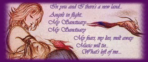
#2 - It's simple and effective. However, the R in "Remembering" is over the rest of the text, and it's more of
R
-
emembering
than anything else. The R should be moved more to the left.
#3 - It's plain. It's orange and there's Barret. The "Yo!" is kind of casual and throwaway. It references with a gamer's knowledge of how the guy talks and draw a smile, but not much else; it's not "wowing". At least with the "Remembering" associated with Aki makes the sig seem deep. (Note that I'm not mocking the Aki or Barret sig: usually people try to make a signature that carries some meaning important to them. I don't, usually. XD )
#4 - I like. The green goes well against the yellow, and it's a really nice crop of an image of Squall and his gunblade. No complaints; the best out of the four.
Good luck with your sig-making and here's to not giving up! *cheers*
Thanks guys for your input. I wasn't at any point trying to be "deep" or anything like that. xD But yeah, the text in the "Barret" sig is kinda cheesy. xD But thanks guys, oh yeah, I'm new to making sigs.
Edit: I made some more, I wanted to make it a little gothic.
#1
#2
#3

Last edited by Chris; 08-31-2005 at 08:51 PM.


the lulu one is awesome! can you do avatars too? pm if you do plz!
sig made by me
I really like the forth one.. its so magical!

I like the one of Lulu best, the backround is radical. Your attempt to make it look "a little gothic" worked to an extent
there's no I in team, but there is in pie, as in meat pie, and meat is an anogram of team
Lulu is teh sex. They're very good Chris I like them alot!
Tôi đói.


yeah, the lulu background thingy is the pie, following the curve of the line makes my eyes go back to lulu somehow which is coolie! the third almost reminds me of lightanddark, with the way the shadows go in the back and stuff! good job! i likes them
Treat yoself.
This signature was made by Sapphiresea.
Cool sigs... ^_^
they r deffinatly HEAPS better than what I can do with paint.NET trial version.
there's no I in team, but there is in pie, as in meat pie, and meat is an anogram of team
Thanks guys, I really appreciate your input.

Yeah, I agree, the Lulu ones wicked. They're all good, but some look like they're missing something. I dunno what tho.
For someone who's new to making sigs, ur doing alright
I'd never be able to make any sigs ever, so in my books ur good.
Thanks Brittany heaps, for this Sig. U rock!!!

I Really like the yuna one, it's really good.
 Posting Permissions


 Reply With Quote


 they are very nice