I lied.
1024 x 768
800 x 600
640 x 480
Comments?
(By the way, Ignore the copyright part where it says for use only in Planet Megaman and Trinity of Evil, I am the author and I approve of it being posted here)


I lied.
1024 x 768
800 x 600
640 x 480
Comments?
(By the way, Ignore the copyright part where it says for use only in Planet Megaman and Trinity of Evil, I am the author and I approve of it being posted here)
"Your lives that I spit on are now but a caricature of a cartoon drawn by a kid who is stupid!" ~Fawful
I like the screencaps, I like the centerpiece, I like the text, and I dislike the random background. The tile and other texture effect is nice, but the coloring seems to be done by use of Difference Cloud or something similar. I abhor that; it's not terribly interesting and just seems to be used to fill up space. I think a great idea for a background could have included the heavens that you battle in during the final battle, but I also think almost anything could be better. :P
The text is gooooood. I like the coloring and raising of his name. I think it suits Kefka. Fine quote and it's nicely legible. The screencaps are nicely spaced out and don't demand too much attention. I wish that the angelic Kefka was bigger, as the paper is all about him and the biggest image of him seems kind of small and blurred (granted, there isn't much to show).
I don't know what else I can say.


I love it. Very... very well done. I do like the tiled background, the font, the haze around Kafka is pretty distracting thoughbut, I am asuming that is how the original pic is set up. damn good job
What a great character.
Bipper
sooo cool. Beautiful!
First wallpaper I've ever seen of Kefka ^_^
Lucklily someone like you came along. Great work!
Thanks for the compliments and constructive criticism(sp?).
I myself am not exactly impressed on how the background turned out, but I don't think it turned out bad either, just not really impressive.
The small size of the angelic Kefka can be attributed due to the lack of CG artwork, and I refuse to use fan art without asking for permission first (which is something I'm honestly too lazy to do)
And the reason as to why I made this is because Kefka is, simply, my favorite Final Fantasy character EVAR!!!!!111ONE!!!
That and I also noticed the lack of Kefka photoshop stuff.
"Your lives that I spit on are now but a caricature of a cartoon drawn by a kid who is stupid!" ~Fawful

Yes it's uh... very nice!

ahahaha! that is great, i love the quotes
Treat yoself.
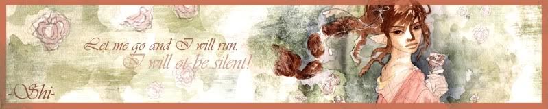
This signature was made by Sapphiresea.
Indeed.
"Your lives that I spit on are now but a caricature of a cartoon drawn by a kid who is stupid!" ~Fawful
 Posting Permissions


 Reply With Quote