hahaha!Originally Posted by Chaos Prophecy.Crash..


hahaha!


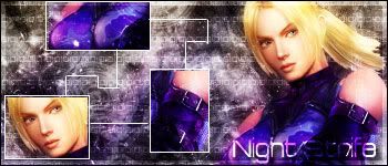
Another sig:
12.
Last edited by Night Strife; 12-18-2005 at 04:07 AM.
Made by me

Wow those are awesome! You're really talented.
Angelic Demon child
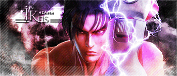
Wow that Jin sig sucks more than I do!! And that means it doesn't suck at all!! That kicks more ass than Hugh Hefner (Sp?) get's. . .Weekly, unfortunately...
Last edited by crashNUMBERS; 12-17-2005 at 02:17 PM.
Oh yes I do like them indeed! Specially the Dante one. I love the fonts youve chosen cause they go well with the background and chosen image! Keep up the good work!
Here's a Dante one, it's an abstarct sig...
13.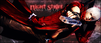
Last edited by Night Strife; 12-18-2005 at 08:53 PM.
Made by me
They're cool!!! I like the one where your username is on the sword!!
:temigi:

:tehidari:
:kaohappy2 Hey, I'm Feena, nice to meet'cha!!! :kaohappy2
Thx to Raven Nox for the siggy!

But his types of sigs use lots of colors with his brushing and multi layers, in that case .jpg is better.
Here's proof.
.jpg
.gif file size = 43.82 KB
.jpg = 26.4 KB plus very minimal BETTER quality, especially in the lighter effects, such as the lightning and the background.
amazeing, i love your Tifa and Dante sigs the most

I like them all. exspecially the one for me!Keep up the good work
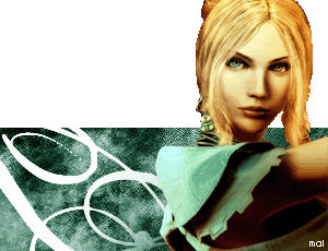
Here's a star tech sig I made based ar'ound my favorite female video game character:
14.
Last edited by Night Strife; 12-18-2005 at 04:08 AM.
Made by me
Cool!!!!!! ^^
:temigi:
:kaohappy2 Hey, I'm Feena, nice to meet'cha!!! :kaohappy2
I've been proved wrong. I don't use a ton of contrasting colours in my sigs, so I didn't know that. Many thanks, for future reference.
Originality is good, kids.
WOW! You are getting better and better!

 Posting Permissions


 Reply With Quote