Page 1 of 2 12 LastLast
Results 1 to 15 of 24

Thread: Wedding Invitations

  1. #1
    Quack Shlup's Avatar
    Join Date
    Aug 2000
    Location
    California
    Posts
    34,993
    Articles
    14
    Blog Entries
    37
    Contributions
    • Former Administrator
    • Former Cid's Knight

    Default Wedding Invitations

    Alright, I'm going insane. I've designed invitations for my upcoming wedding and I can't decide which one I want to use.

    This one I designed for BJ. If anyone has any ways to improve it I'd love to hear them.


    Now I want to have another invite for me. I like BJ's, but I want a pretty flowery one, dangit! So we're going to have two.

    Here are mine:

    #1


    #2


    #3


    #4


    #5


    #6


    #6b (someone suggested it would be better in pink)


    #7


    Honestly, I'm mostly just torn between #3 and #7. I'd also like to hear ways to improve 'em so if you have any suggestions please let me know.

    And Raistlin's opinion doesn't count.

  2. #2
    Princess Tempest's Avatar
    Join Date
    Dec 2005
    Location
    My Palace
    Posts
    2,545

    Default

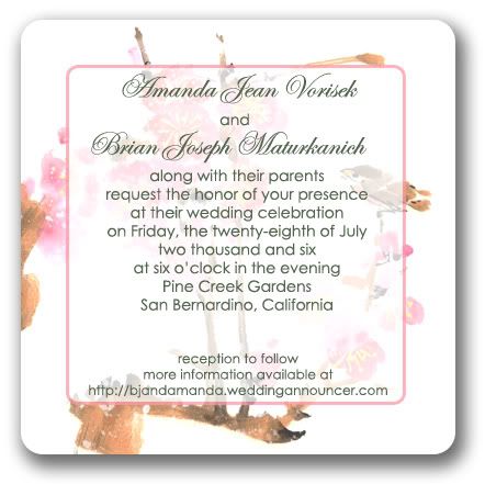
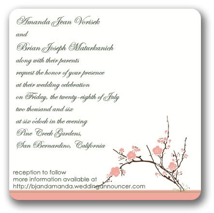
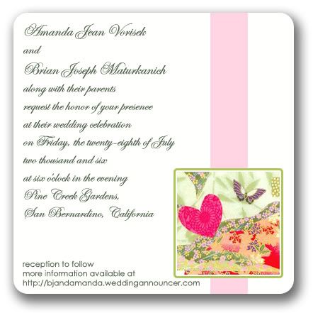
    I like the print in 3 and 7 but I like the backgrounds in 1 and 2. Maybe see how those look together.
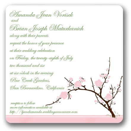
  3. #3
    permanently mitten
    Goddess of Snacks
    Miriel's Avatar
    Join Date
    May 2002
    Location
    San Francisco
    Posts
    13,578
    Blog Entries
    3
    Contributions
    • Former Cid's Knight

    Default

    #3!

    NUMBER THREE!

    Numero tres!

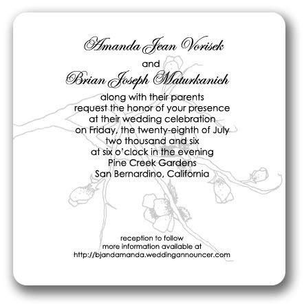
    Although the far left branch hitting the text on the bottom there doesn't look to great. Maybe scoot it a little up and a little to the right? But yeah, I like #3.

  4. #4
    Quack Shlup's Avatar
    Join Date
    Aug 2000
    Location
    California
    Posts
    34,993
    Articles
    14
    Blog Entries
    37
    Contributions
    • Former Administrator
    • Former Cid's Knight

    Default

    Yeah, that branch on #3 is bugging me too. But at that point in putting them together I was too lazy to fix it.

    I'll move the branch up next time I fiddle with it.

  5. #5
    permanently mitten
    Goddess of Snacks
    Miriel's Avatar
    Join Date
    May 2002
    Location
    San Francisco
    Posts
    13,578
    Blog Entries
    3
    Contributions
    • Former Cid's Knight

    Default

    Did you design all these yourself or did you have some sort of wedding invitation magic design thingamabob?

  6. #6
    Quack Shlup's Avatar
    Join Date
    Aug 2000
    Location
    California
    Posts
    34,993
    Articles
    14
    Blog Entries
    37
    Contributions
    • Former Administrator
    • Former Cid's Knight

    Default

    I designed them myself. :-*

    I've been collecting cherry blossom art; good ones are hard to find. I finally gave in and drew one, which I used for #3. BJ's invitation graphics are from an invitation I ordered a sample of and then just scanned the graphic to use for my own design. ^_^

  7. #7
    I have one of these now. Epiphany's Avatar
    Join Date
    Sep 2005
    Location
    'Kay.
    Posts
    675

    Default

    I like 3, 5, and 7. But mostly 3.
    You DREW that? Quite skilled.

    Originality is good, kids.

  8. #8
    Quack Shlup's Avatar
    Join Date
    Aug 2000
    Location
    California
    Posts
    34,993
    Articles
    14
    Blog Entries
    37
    Contributions
    • Former Administrator
    • Former Cid's Knight

    Default

    Well I had something to look at.

  9. #9
    dizzy up the girl Recognized Member Rye's Avatar
    Join Date
    Dec 2002
    Location
    a tiny boot
    Posts
    24,891
    Articles
    4
    Blog Entries
    3
    Contributions
    • Hosted Eyes on You
    • Former Cid's Knight

    Default

    1 and 3. Those are beautiful.


  10. #10

    Default

    I like #3, #5, and #7 but I like #5 and #3 the most

    i'm giving up,
    on the entire human race....

  11. #11
    Quack Shlup's Avatar
    Join Date
    Aug 2000
    Location
    California
    Posts
    34,993
    Articles
    14
    Blog Entries
    37
    Contributions
    • Former Administrator
    • Former Cid's Knight

    Default

    Alright, that settles it, I'm going with #3. I'll have to tweak it into several versions later.

  12. #12
    Quack Shlup's Avatar
    Join Date
    Aug 2000
    Location
    California
    Posts
    34,993
    Articles
    14
    Blog Entries
    37
    Contributions
    • Former Administrator
    • Former Cid's Knight

    Default

    I tweaked #3 a bit... Which is better? I can't decide whether to go with a white background or an ivory background (not that you can really tell on the computer).


  13. #13
    Ten-Year Vet Recognized Member Kawaii Ryűkishi's Avatar
    Join Date
    Sep 2000
    Location
    Moonside
    Posts
    13,801
    Contributions
    • Former Cid's Knight
    • Former Administrator

    Default

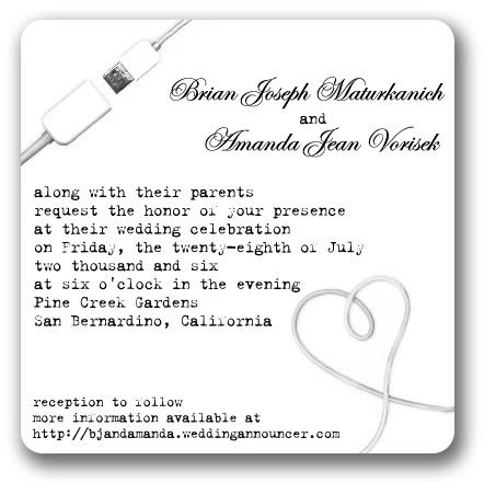
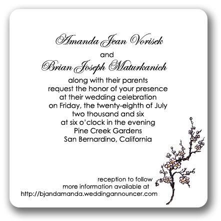
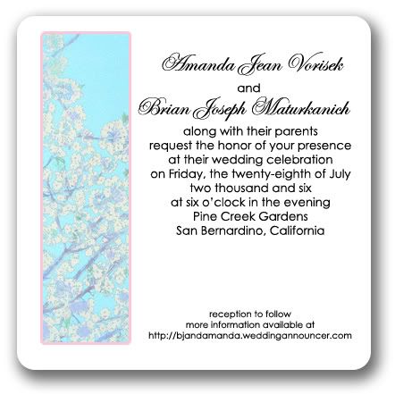
    One on the left is easier to read.

  14. #14
    Quack Shlup's Avatar
    Join Date
    Aug 2000
    Location
    California
    Posts
    34,993
    Articles
    14
    Blog Entries
    37
    Contributions
    • Former Administrator
    • Former Cid's Knight

    Default

    I was afraid of that. xP

  15. #15
    permanently mitten
    Goddess of Snacks
    Miriel's Avatar
    Join Date
    May 2002
    Location
    San Francisco
    Posts
    13,578
    Blog Entries
    3
    Contributions
    • Former Cid's Knight

    Default

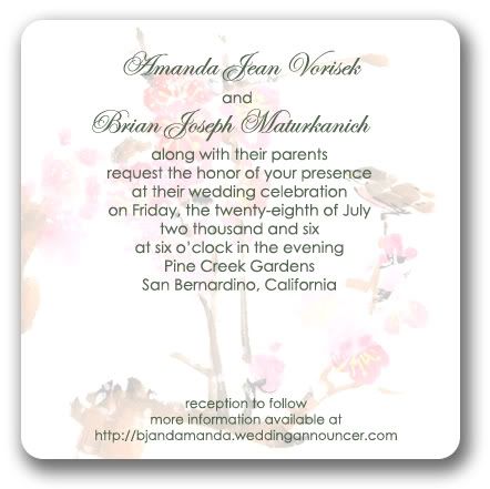
    I like the colors better on the left one. The branch is still, you know, ARRGGHGH.

    But I like the ivory tone for the background more.

Posting Permissions

  • You may not post new threads
  • You may not post replies
  • You may not post attachments
  • You may not edit your posts
  •