


Usually when making my signatures, I come up with a template design and then create a series of different banners based around it, before making a new template and moving onto that.
Now, here is my current problem.
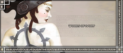
Above is a signature template that I created recently, pluse two examples of it's use. I personally quite like it, but no matter how often I look at it, there seems to be something lacking in it's overall design. I think it's possibly a lack of anything definitive in the top right corner. It makes it seem somewhat more barren than it should be.
I was wonder if some other banner creators here could offer me some advice on things I could do to rectify this? Of if you're willing, do a mockup or alteration to one of them for me that would eliminate the problem. I will be more than willing to credit anyone who does, if I choose to use any of them.
(If you require the original .psp files, feel free to PM me with your email address and I'll send them to you.)


 Reply With Quote