Signature: 8.5/10
It's a nice colour scheme and simplistic enough to be very effective. Good job.
Avatar: 7/10
I think it could do a bit more to match your signature, but it's decent enough.

Signature: 8.5/10
It's a nice colour scheme and simplistic enough to be very effective. Good job.
Avatar: 7/10
I think it could do a bit more to match your signature, but it's decent enough.
"... and so I close, realizing that perhaps the ending has not yet been written."


Avvy: 9/10-love it!
sig: 9/10-love the unique shape and the action


Avatar: Simple and I know what it is. 10/10
Signature: It's pretty bleached out. I think it would look better if it wasn't so bright but that's just my preference. 7/10
Overall: Your av and sig go together, which is a requirement. I think if the colors matched a little better it would be a knockout. 8/10
I'm sporting this avatar temporarily so I figure I'll see what someone thinks.
avvie: 10/10 its just totally awsome.
sig: 8/10 clean and simple, but i never played FFVI, so the greatness facotr is but limited
My great creation *drools*
Avatar: 8/10 I know how badly you love Ty Lee is a fair small representation
Sig: 8/10 Not my best, still you asked it to be simple! I love the Aeriht's Knight font, I gotta be honest! ^^ It was quite a challenge to make a banner with three images and find a cool focal!
Avvie: 7/10. S'alright. Nice and bright, but something in the proportions of the picture feel a little off. Also feels kind of messy somehow. I dunno.
Sig: 10/10 - Not a single thing I don't like about this: colour scheme, subject matter, text - all fabby
Overall: Averages out to 8.5/10. I'll give it 9/10 because I adore the sig.
Your sig is really nicely made. I especially like how you used your own drawing in it. 8/10
As for your avatar, it's a cut out of your sig so it's a little repetitive but it fits with your sig. 6/10

Well... Is that a work or is it just a random image? I would give it a 2/10... It has no effects, no borders, just one render...
Same goes for avatar...
Every light must fade...
Every heart must return to darkness!!!!
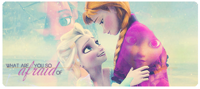
I like what you've done ith your avatar, i like how the eyes change colours, and how the characters mirror. I give it 7/10.
As your avatar, i'll give it a 4/10. it's nothing majorly special but i like how the theme fits well.
Avvie 6/10 - it's nice, but I think you could have picked a different, more captivating shot than the one you used in your sig.
Sig 9/10 - fantastical, i love it. Great colour scheme and effects.
Overall 7/10 - the avvie would complement the sig better with another shot imho.
edit: wewps, i didn't realise this thread had been going so slowly xD ignore me
Nausus
Sig: 8.5/10
Great use of effects in the text, and also a good combination of the colors with the image, but I don't like that black border in the right, maybe another color (ending it in blue) could work.
Avvy: 7/10
Nice, but another image that still worked with your sig could be greater (or some effects in the avatar itself).
scrumpleberry
Sig: 9/10
It's great, it has a simplistic feel and also a great combination of images and the effects
Avvy: 8/10
It's cool, but I'm not that fond of avatars taken from a piece of the sig, without giving it their own personality.
OT: It has been slow since forever, so don't worry.
Originally Posted by Nausus

Yep. it's my tattoo xD
Do not evaluate my work... not my turn yet, just wanted to answer ;p. Evaluate Ramza's
Every light must fade...
Every heart must return to darkness!!!!

Ramza, beautiful cut out! There's not a stray pixel in sight ( my trouble with transparent cut out sigs )! The colors are bold and playful and they really grab your attention. I think the glow around the text inside the signature is a little bright though. Even though I'm not really a fan of Megaman, I do think that the sig is well executed! 9/10!
The avatar is pretty smashing too and I like how its not in the traditional box shape. 10/10!
Don't normally do this, but I really like Fuzakeru's set so I'll rebel against what I normally do.
I really like the signature. It's nice and colourful and really eye-catching. It also makes me want to eat an apple. Nice rainbow colours and it just adds a bit of life to the place. Also your avatar has a nice border and borders are excellent. 9/10
Not my words Carol, the words of Top Gear magazine.
This set makes me think of gone in sixty seconds. Thats awesome. 8/10
 Posting Permissions


 Reply With Quote