Good artwork. Freya + Bahamut = good combo.
I love the greyness of your siggy. The drawing on the avatar is exceptional. Awesome set.
10/10 for both.


Good artwork. Freya + Bahamut = good combo.
I love the greyness of your siggy. The drawing on the avatar is exceptional. Awesome set.
10/10 for both.
Rye made this!


Cool avatar, with good design and a good color match in it
9.5/10
The sig... Just plain awesome, a good color match, and actually, I like the images
10/10
avatar = 9.5/10
signature = 10/10
(good work rye XD)


That's cool, I like signatures that aren't the usual shape. Nicely made! The only thing I don't like is the font used for your username. Doesn't quite look right. 7.5/10 for the sig, and 8/10 for the avatar 'cause animation rocks - no border, though, so I took away points for that.

8/10, I'm not really into the whole animated type sigs, I think they can look better with a still picture, but thats just my opinion, other than that I think it looks pretty nice.
Been dying to rate this sig! I adore the anime woman, is it Motoko from GITS? Anyhoo, its very well positioned in your sig, I like images in the right hand corner. The background has blends very well with your text and image. Very excellent work. Your chosen font is great too, positioned well too. A nice border thrown into the mix also.
The avatar is of a nice lady, possible yourself or someone you know
Sig: 8/10
Avatar: 6/10
Whoever rates mine can you please make it a decent rating please? This is the first time I attempted this style and Im quite proud of it.
I really like it! The picture is good and the text matches well. It's simple, but it's hot. I think the only thing I could have suggested was a reddish-brown border, but the white works good anyways.
9/10
I am at a loss as to what the picture is from/about, however, I love it. I like the rounded edges in the sig and the part of the sig you chose for your avatar. Like I've said before however, I dislike when avatars are taken from the sig, but yours works (looks better than a face taken from the sig).
Good Effort.
Avatar 8/10
Sig 9/10
AHAHAHAHAHAHAHA! 9.76/10
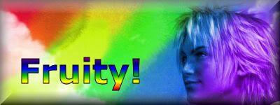
PH33R teh Rainbow.
Taste the Rainbow
I don't get it >_> good though, 7/10. The balloon is kinda outa place...
Gara is overrated. 8/10 for cool filters though.
Kaycee says (12:06 AM):
whos' obama?
I can't tell tell who's in the sig and avatar. It still looks cool though.
Sig: 7/10
Avatar: 9/10
Last edited by Evastio; 05-05-2006 at 02:27 AM.
Avatar: Can't really tell what it is, but it looks cool I guess.7/10
Sig: How can you not like this sig? I guess I'm the only one who thinks it's funny.
Avatar: It's blurry, so only 7/10. And yes, I know I'm the one who made the damn thing.
Sig: I see no problem with it, other than the fact that I can't read it because it's in Japanese. 10/10.
Sig:
Nice blending, and I like the text. Short and not too fast. 10/10
Ava:
Well it is kinda simple, though it goes with the sig. The avatar seems just like a crop and resize of a screen capture, so I guess a 6.5/10.
+1 Bonus marks for sig and text matching in hues.
A cute avy n.n, also, I like leviathan. 7.5/10
the sig is great, and it has a great color match 9.5/10 n.n
 Posting Permissions

 Reply With Quote