OOC: I don't get why people deduct points for people using cropped versions of their sigs as avatars when the critic themselves is using a cropped version of their sig as an avatar.


OOC: I don't get why people deduct points for people using cropped versions of their sigs as avatars when the critic themselves is using a cropped version of their sig as an avatar.
Kaycee says (12:06 AM):
whos' obama?

OOC: Haha, Indeed. That's pretty funny! I deduct points, but I don't use cropped images so..... BTW rate jesteranimefreaks set.

jesteranimefreak: Plain, but effective. 7/10.
The hair and the wings are really nicely drawn. 8/10
Edit: Zeromus_X beat me to rating jesteranimefreaks set. I guess I'll have to rate 2 sets.
Avatar: Can't exactly tell who's in it. Still looks cool though. 8/10
Sig: The quote's quite funny. 7/10
Originally Posted by Rengori
OOC: I find this insanely amusing...[/sarcasm] You'll notice it's only one point..... (PS: rate Evastio....)


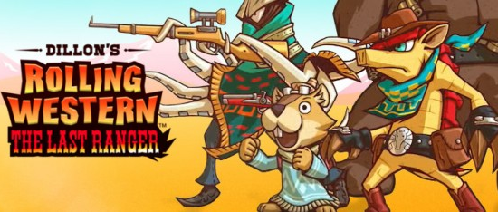
Old NES graphics = instant win. 9/10 for the sig, 7.5 for the avatar since it's a crop and it's not shaped quite right.
EDIT: You can have this one, if you want.
Last edited by Roto13; 06-02-2006 at 03:24 AM.
I'd give a 9 on the avatar, since it seems kinda blury, but a 10 on the sig. Love it

I like both the avatar and the sig, but they don't match. I suppose it doesn't matter, though. The sig is the best part, nicely made. 8/10 for avatar, 9/10 for the sig.
Its ok, too big for me. The text used is great and blends in well with background. I love the background and if the image was added, its been cut well. If not, thats ok. No borderAvatar isnt a cut, just a random image of the chosen character. No border.
Sig: 6/10
Avatar: 4/10
Another excelent work Sapphire, the only problem with the sig is the line between the photos makes it looks a little bad, with transparency between the two would look awesome n.n, 8.5/10
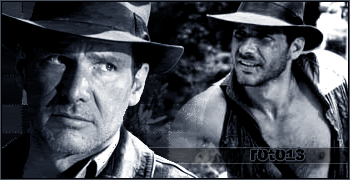
The avvy looks good, but is just a photo 7/10
OOC: The image was, in fact, seperate from the background.
Very well done. I loved that game and your signature illustrates its greatness perfectly. Awesome affects, good shape, and perfect positioning of text and character. An excellent sig fitting of a game so good. I'll give you a 10/10 for the sig, and a 8/10 for the Avatar.
Sig - 'Tis a good drawing, and the sig is humourous. Besides that there's really nothing to the sig at all except some text and a border. Then again, that's really all it needed. Only suggestion: Make the text in the top left so it doesnt overlap the guys face.
7.5/10
Av: Too much text crammed into that tiny picture. Looks like it actually extends onto the border. I would've just left it off if I were you.
7/10
I love your sig, GooeyToast. Interesting, different style, and the way the images are arranged really works. Pretty colours, too, and the snowflakes look cute. 9/10. The avatar is nice, and not a cut of the sig, which gets it an 8/10.
Oh boy. Oh boy.
10/10
Its just the best.
 Posting Permissions


 Reply With Quote