
6/10. Its only a rat (excuse me. THE rat) on a background


6/10. Its only a rat (excuse me. THE rat) on a background
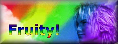
PH33R teh Rainbow.
Taste the Rainbow

7/10, not really liking all the different things put into it, and I personally don't like lens flares added to any pictures.

Oooh, very nice. Lovely colouring, image and style. 8.5/10 for avatar and sig.

I know it's supposed to be once every 10 posts, but I just made a new sig/avatar combo, so the purpose of the rule (to keep the same few sets from being rated all the time) is still fulfilled. Therefor, I didn't think anyone would mind.
EDIT: Oh, yeah, 10/10, because it's very well made.
Last edited by Roto13; 05-01-2006 at 01:36 AM.
OOOHHHH ^_^
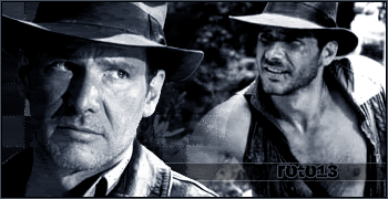
Huge Harrison Ford fan here!! Love this set, its simple and I love it. Great position of the text and image used. Pity there isnt a border though. The avatar is great also because you have used a different image, again no border.
Excellent set there!
Banner: 8/10
Avvie: 6/10
8/10, It gives me the creeps it's so dark. (The "*shivers*" kind of creepy) Very well made and detailed.
Last edited by Faris; 05-01-2006 at 01:15 PM.
4444444444 4 4 444 44 4
Kinda plain, not much to comment..... interesting background effect, 4/10
There's not really a background at all...but funny =P 6/10
I like your sig. Especially how it's all dark. 7/10
My sig and avatar are turd at the moment and I plan to change them, but comment while they're still here!
Evastio, your avatar's okay. No idea what it is, but nice range of colours. As for the sig, I don't personally like it. A badly-drawn table and a puke/turd greeny-brown floor. Bad anti-aliasing on the copied/pasted characters, it seems. However, producing something like that is hard anyway. For the time you probably spent on it, I'd actually say it's okay.
Hope you take this as constructive criticism!
I think I spent 30-60 minutes on the sig.Originally Posted by Shaun
I know it isn't the best of drawings. I don't know how to draw more realistic tables and windows. I also had no way of making sure all the character sprites were the same size.
Sorry, but this is no place to post your opinions. PM Shaun if you need to get your point across to him. You are supposed to post once every ten posts. You posted 2 posts ago. I will rate your set anyway.
Avatar: looks cool, but too plain: 7/10
Sig: Colours look awful, and i don't 'get' it: 2/10 (2 for the FF Sprites)
Overall: They do not match or go well together: 4/10
Feel free to ignore this post as I also have posted less than 10 posts ago. Please rate Shauns set.
hmm I don't like the sketches, that's it plainly, a 2/10
That girl needs less eyeliner. And a border could help too. 7/10.
Kaycee says (12:06 AM):
whos' obama?
 Posting Permissions

 Reply With Quote


 7/10
7/10

