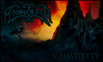
I love the games the sig. and ava. are from but there too basic for me.There should be more characters not to mention color or graphics.But it's a good drawing.
Avatar - 7.3
Sig. -8.5


I love the games the sig. and ava. are from but there too basic for me.There should be more characters not to mention color or graphics.But it's a good drawing.
Avatar - 7.3
Sig. -8.5

Oh I like this! VC does excellent sets. This one is beautiful. Stands out well and I like where Roxa (?) is positioned. And the girl on both sides of him have been faded well and I love the glow. The colour scheme is excellent and makes the set seem warm. Well made with a lovely border and text.
Avvie is a good cut of Roxa.
Sig: 9/10
Avvie: 7/10
*Sorry if I have the guys name wrong!

Cool I like yellow and snake you get a 8/10
Yellow Winged Angel
im not sure if urs is a default avatar or not made by eoff but it looks cool and it matches ur sig well because they both look like warriors.i like the shading on ur sig! avatar:7/10 sig:9/10
note:i didnt make my sig,it was made for me by Paine

well, the sig is really cool, and it has a good effect, but the left image looks a little faded, but is okay n.n, a border would have been really cool, but meh, it is good n.n 8/10
the avy is just a normal image though... 7/10


Well first of all you have the same theme for both the avy and sig, so extra points for that.
I like the shape of your sig, its nicely rounded off and the colour also comes out good. The waves going left and right are also cool. I like the way that 'Ramza' stands outside of the sig. It gives it a sort of fresh feel. Oh and he's glowing!
Your avy is from a part in your sig and is changed a little, which is good. I also like the fact that 'Ramza' keeps popping up. Other than that it looks a bit plain but who am I to talk.
Sig: 8.5/10
Avy: 7/10
Kind of basic.....
Avatar= 6/10
Sig= 5/10 for the shape and size....
Your avatar and sig is funny. I still feel kind of sorry for the snowman though. 8/10
Not really sure how to rate it, seems kind of simple, but I guess its funny, so.. 8/10.
I really like it. It has a cool anime picture and I like the background to it. You're good at using grey in sigs and making sigs have that cool "metallic" feel to it.Also, I like the blue-green colour. Where do you get your brushes (I assume that you use them, but you might not, so sorry if you don't xD)?
9.5/10
Sig: It has a nice orangish brown tone to it, and I like the use of text in the top right witht the heart. Other than that there's not much to it, though it has a nice appeal.
8.5/10
Av: Simply a crop of the sig with a bit more saturation. It could use a border, it doesn't look like it has one.
7/10
Beautiful mixture of colors and pictures.
In both the avatar and sig..
Avatar - 7.5
Sig. -8.3
That wierd Sora lookalike is kinda blurry, but that's about all I can bitch about. Everything else is done really well and VoodooChild should be proud.
9/10
Kaycee says (12:06 AM):
whos' obama?
Very nice, I like the image in your sig. No idea what it is, but its awesome. But I dislike mismatched sigs and avatars, so you lose 1.5 there. I'd do a crop job of your sig if you like.
8.5/10
Leave some shards under the belly
Lay some grease inside my hand
It's a sentimental jury
And the makings of a good plan
 Posting Permissions

 Reply With Quote


 Nice avy too