You had a different set earlier today.


You had a different set earlier today.
Kaycee says (12:06 AM):
whos' obama?

it was still a tifa.
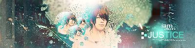
I like the lighting effects in the sig & avatar. 7/10


Your sig is soooooo cute, and colourful. I love it, but it needs a border ^^.
sig:8/10
avy: 8/10. I like it.

Um, well... the first thing I'd say is that the text looks a bit randomly placed, and like it doesn't fit. For some reason, the images looks of bad quality. The sig looks alright as a whole, though, so I'll give you a 6/10.
The avatar, again, looks like it's of quite bad quality. I think that's probably the fault of the image used, though, not how you made it. 6/10 again.
The avatar and the sig makes a good combination together. It is nice in overall and the guy in the sig make a good calibre for my new wicked ritual.
But the line in that avatar make it look like that dude had a moustache.
Avatar = 9/10
Sig = 9.5/10
PS: This is to respond to Owen's post but MY FAVOURITE CHEESE beats me to it.
The next poster can comment on MY FAVOURITE CHEESE instead of mine.
PS again: Sigs and avatars must never fail to be amusing of course.
Lol, Christamse. thanks ^^. and thanks spiffing cheese ^^.
Who do I rate? Ahhh I so confused lol
I'll rate all three of ya!
Spiffing Cheese--
Sig: good background and it blends well together, but the words are hard to read 9.5/10
Avatar: looks pretty 10/10
Christmas--
Sig: a bit simple, but it looks good 9/10
Avatar: pupu! 9/10
Owen Macwere--
Sig: Good background, everything looks good 10/10
Avatar: Good, yet something disturbs me about it 9.5/10
No sig from what I saw. However, the avatar is nice 9/10 for that at least..
Ah now that the sig shows, nice one. Far from the fanciest around here but it holds it own 9/10.
Last edited by ShunNakamura; 07-15-2006 at 05:55 PM.

STILL Updating the anime list. . . I didn't think I was that much of an anime freak! I don't even want to consider updating the manga list!
I don't know why my sig isn't showing up, it's there if I go to edit it. Go to this link then: http://i28.photobucket.com/albums/c2.../samus-sig.jpg
Edit: Oh now it shows up! I truly have no idea what happened, lol, so I guess you can rate it now, ShunNakamura.
Edit again: Just rate it in your original post, Nakamura, since ~SS~ already rated yours. God this is messed up
Edit strikes back: Thanks!
Last edited by Medi; 07-15-2006 at 07:57 PM.
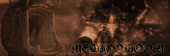
Rye made this!
So people dont get too confused with whats going on, Im rating ShunNakamura. Then someone rate mine.
This is a wicked set. The text is very wild west, readable and is a good size. The image of the cowgirl is a little blurry, that may be my monitor, not sure. But its a good position. Nice cut of the actual background, nice clours too.
Avvie includes a cut of the cowgirl and some funky green. Nice border though.
Sig: 9/10
Avvie: 6/10

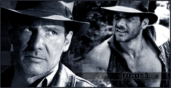
The avatar could have been fine, but the "returns" is impossible to read, so I'm going to have to give it a 4.
The sig, however, is lovely. Nice colouring, and I like the use of text. I also like that it's nice and small. 9/10.
Roto has the whole Indiana Jones theme going.
I'm not exactly sure what to say, the pixelated-ness gives it something, but it also detracts from it, not quite sure how to describe it so...
8/10 for both
THE JACKEL
add me, PSN: ljkkjlcm9
Avatar: 7/10 I don't really see anything too special about it.
Signature: 9/10 Heh, I like it. It's busy, and funny.
Avatar: Relm rocks. 10/10
Sig: Could be a lot better. 5/10
Kaycee says (12:06 AM):
whos' obama?
 Posting Permissions


 Reply With Quote