sig:9/10.
avy:9/10.


sig:9/10.
avy:9/10.

Sig: 10/10
Avvie: 9/10
avatar: 8/10
Sig: Awsome 10/10, I love the red and black!It's modern!
It's a pretty picture, but there really isn't much to it. I would have added a border or maybe the tiniest bit of text, or something. So I like it, and you had a good eye for the picture, but there really isn't anything to it.6.8/10

Rye
Sig: Wow, yet another gorgeous sig from you. The background is superb, I really like those brushes with what looks like stamps or something. The render is excellent, and I like how it looks like a cutout of sorts. It really contrasts nice with the background. Only thing I would've added was a little bit thicker border, otherwise it's excellent. 9.8/10
Av: It's a great picture, and you have a nice border on it even if it's a bit hard to see. 9/10
Gooey:
Sig: It's cool, even though I can't tell what's in it.
Av: Again, cool but unidentifiable.
8/10
Kaycee says (12:06 AM):
whos' obama?
Originally Posted by Rengori
OOC: It's a man looking out at the solar system from an upcoming movie. What's so unidentifiable about that?
(Rate Rengori's)
I like the reddish tint in your sig. THe avatar is nice as well.
Avatar: 9/10
Sig:8/10
original and neat avatar- 7/10
sig can be a little neater, but if you used paint, i give you a 9/10
Both the sig and avatar are beautiful and clean. I really like them.
10/10 each
Rye made this!
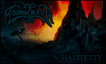
i cant really make out the avvy but maybe thats coz i dont no what the beast is but it looks cool and its nicely done 9/10,im not sure if Rye did ut sig or not but either way its pretty good!the highlights are done well and the font is cool too,the sig itself though seems a bit cloudy in a bad way and there is no border so i'l give it 8/10
It's really hard to see what the image in the sig is, but I like the way it fits with the background. The text is alright, and the sig looks nice overall. 7/10 for the sig and 6/10 for the avatar. Could've been better without the grid, I dunno.
I love your signatures, Emma. They always look so dark, and I like how you use colour themes. Your signature and avatar just don't match though, Its awesome! but dosn't match with your signature at all.
Id like to see a signature the same as the ava
Signature ~ 9/10
Avatar ~ 7/10
Zeldy.
sig i already told you I love the style so 9/10
avy nice animation so 9/10
Signature: Its too cluttered and messy looking. I think you overused the square pattern, and the font doesn't really appeal to me either. 5/10
Avatar: The square pattern still looks messy. The picture looks like an eye. It's not a good crop from an image, but I'm not sure. 5/10
 Posting Permissions


 Reply With Quote