


Eh, its not like I dislike the theme but I'm not interested in it but that's a personal thing.
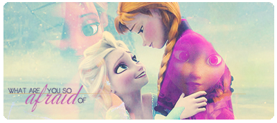
The effects are really nice. In the signature the yellow spheres really stands out but not in a dominating way. It just sorta helps move your eyes through the picture and the curve of yellow on the right sorta softens the man's masculinity and makes the picture seem that much more romantic. The stars are wonderful too! Reminds me of a cheesy 90s prom movie ( which might sound insulting but I mean it as a compliment! )
My only true complaint on the sig is that it just doesn't seem cut right to me. There's too much empty space at the top and the people surrounding them takes away from the intimate feeling the signature emits. Due to that I think I like the avatar more since its focused.
Avatar - 10/10 Even though I'm not a fan of the subject, the avatar itself is lovely and despite people disliking cuts from sigs, I like them ( especially here at EoFF when you don't have much freedom with avatar limits )
Sig - 7/10 Like stated before, the effects are made of win and awesome but I don't like the cut very much.
<3333 Nice job!

 Reply With Quote