Good news


Good news
Agh! The CK removed mine just in the nick of tme, because it was 1.5kb over the limit! WOW! Now it's 23kb, and probably as gritty as Hell... Anyway, if somebody could rate mine now instead of breaking the rules of the topic?
Dafcorgis, your sig is just great.


Shaun:
it is cool, as you drew it by hand.
sig: 8/10
avy: 8/10 as well.
PS: FF_sweden hadn't been rated, so please whoever post after me, rate mine and his. thank you...


ff_sweden
The avatar is just a picture of a flag cut into a heart shape. It's not what I prefer, but still a nice statement of your name. 7.75/10
The Signature is nice (FFIX ftw), but I don't get why have boxes, but whatever it's doing, it looks interesting. 10/10
Owen Macwere
The signature is nice and colorful (the rainbow effect is excellent).
Unfortunately, it's of FFVIII (minus .0001 points). 10/10
The banner is definitely a cool idea, and both the banner below the sig and the avatar match. Matching images are our friends. 9.5/10 for the avatar and 9.5/10 for the banner (simply because it's a new idea, so it should warrant a rate).
Really cool set Tavrobel
The signature is cool, and the colors on it are too 9/10
The avvy is a cut of the sig, just with a border... 7/10

Ramza Beoulve
Av: Neat with a cool effect, and it's got transparency. 10/10
Sig: Okami, cool background, transparency, your sig just seems perfect. 10/10
Kaycee says (12:06 AM):
whos' obama?
Rengori
Av: small, but it fits well and looks good 10/10
Sig: simple, but well done, and the background fits with the theme. I like it. 10/10
Chibi Youkai...
Av: 10/10 -- Very nice.
Sig: 9/10 -- Great, but add some bravura.
------------------------------------------------
Bush = Worst Disaster
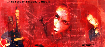
8/10 - Red is a cool colour.
"... and so I close, realizing that perhaps the ending has not yet been written."
Omecle
I love it! It's really tidy and neat, and the transparency is a very nice touch, especially as it's so well done. I can't find any faults. Plus Mario is awesome. 10/10 overall.
Spiffing
Sig: I think this is one of your best so far, it really has a very textured feel to it (at least for me). The font is great, with nice extrusion and stroke. Love the heart brush in the background. Render really contrasts well with the background, if a little light. 9/10
Av: Good cutout, although I would've picked a different part of the sig to show. 8/10
The pink tint fits your avatar and sig. 7/10
Evastio-
sig- 5/10-I'm sorry, I like the photoshopy-feel.
avatar- 5/10-same reason
Atlanteay's awesome work.
sig: 10/10
avy: 9/10

I like the signature, but I don't like the amount of text (maybe just the rider and the car model?) 7/10
I dislike the avatar, it would be too hard too tell what it is if you hadn't seen the sig beforehand. 5/10.
 Posting Permissions

 Reply With Quote