I LOOOOVE UR SIGZ MAN THEY R NICE....U MADE MINE!!! I APPRECIATE IT KEEP UP THE GOOD WORK HUN


I LOOOOVE UR SIGZ MAN THEY R NICE....U MADE MINE!!! I APPRECIATE IT KEEP UP THE GOOD WORK HUN
Thank You Owen Macwere

thank you ^^. and a new sig. I just can't stop making them....
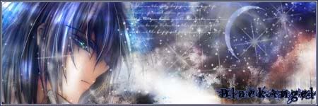
I like the right side, it looks like sun sitting with a planet. I didn't plan it to look like this, chance I guess ^^!. so opinions??
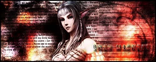
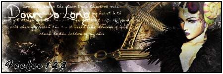
yea its HOTTTTTTT!!! lol i actually like it she looks sooo evil and seductive in a way and very nice that whole thing iz on fire!! keep up the good work
just trying to save you guys some time. So everytime instead of stroking three times, just apply layer style with a click:rolleyes2Originally Posted by ~SapphireStar~
I used layer style sometimes and also gradiant and I don't like their effects much. here I used gradiant effect in the text here. not so good.
what does everyone thing of this one is it good?
I made this upon a friend request and I liked the way it turned out to be ^_^.
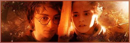
and ~SS~ a HP sig, not that good but it is first try ^^:
Last edited by Owen Macwere; 07-03-2006 at 11:11 AM.

They seem okay but I'm not really a fan of the sizes. Oh and yeah, they all seem random so try slowing down until you get an idea but overall, pretty good.
what does random means? thanks for the commets though. and I think that this sig is not bad, bet too dark but it just to fit the render used in it. feedback??!!
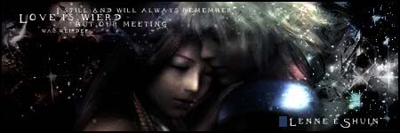
Your latest signature is indeed too dark. The text is fine, the background seems fine, but you cannot see a anything of the two characters that you tried to focus on. The only thing that's easily visible is Shuin's shoulder and the background behind it. It makes for a terribly unbalanced image.
[What "random" means]. It is possible that she is saying that you have no direction, focus, or theme in your work. You grab what renders you like and follow tutorials to create your output. The effects too are rather erratic and just shoved in there to give a "random" effect.
Please don't speak about things you know nothing about, I don't use tutorials to make my sigs and I don't just pick random renders and play around with them. thanks for the feedback. but it was a bet too harsh to chuge me like this and these can be cauned as me best, you wont have said this if you had took a look at me first sigs cause they sucks *_*.
Last edited by Owen Macwere; 07-03-2006 at 06:01 PM.
the latest one is pretty. The darkness is very mysterious and cool.
i don't think your sigs are random. THey just don't stick to one thing but they still look good so it's ok
Thank you, And I will try to make my sigs better now. feedback only too helpful.
thank you very much atlanteay.
you're welcomeyour sigs are getting better and better. The theme really doesn't matter here, it's the design and overall look. Does the render, background, text fit well? If it does then it's a good sig
Thanks ^^, now what about this sig?
I made it few days ago for a tutorial I posted here. anygood?
Last edited by Owen Macwere; 07-05-2006 at 09:41 PM.
I'll admit it, your newest sig is pretty smurfing good, everything matches.
Thank you Raebus, this one looked like I wanted it to. so any good?

 Posting Permissions