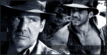
hi,i was just wondering if i have done a good job at making my first sig in photoshop.i only got photoshop about 2 days ago and am still learning new things.does anyone think its good?


hi,i was just wondering if i have done a good job at making my first sig in photoshop.i only got photoshop about 2 days ago and am still learning new things.does anyone think its good?
Last edited by Clone 01; 06-17-2006 at 12:17 PM.
Not bad, could have blurred the edge of the two pics together.
"Reality is that which,
when you stop believing in it,
doesn't go away".
Philip K. Dick

well, as first attempt it is not bad at all. good work, and photoshop is not that deficult. good luck ^_-

For a first attempt, it could be worse. The fireball looks kinda lame, though. Replace it with a lense flare or something. And sigs need borders!
Keep practicing, and you'll get good.
lense flare can be done like this, in case you want to know:
filtter> render> lense falre, and put your sittings.
don't worry, you'll get better, my current sig, is my first attempt to make such things too, so cheer up, and learn fast. I'll wait for more sigs from you.


Or just be smart and avoid lensflares alltogether, they give off an amateurish look.
everything is wrapped in gray
i'm focusing on your image
can you hear me in the void?
The sig is okay. It is sort of plain, and the pictures are not blended, making it look really "MSPaintish". I can compliment the font though, it looks nice. But may I suggest using a brush for the background? And blend the pics, and add a border. Once you've done that, it should look good. Nice first try though, mine were much worse when I started.
yeh i agree the flame looks completely terrible but ill try fix it up,i dont no how to blur them together.i made another sig just now,wat do ya think?do ya think its not sharp enough?
Its good, but the image quality isn't too great and it still needs a border. Fix that and its great.
ok thanks,but how do i fix the image quality?and i fixed my first one,i think its a bit better now
Last edited by Clone 01; 06-17-2006 at 12:18 PM.
Save it as a better file extension, usually. And now theres only one thing wrong with the one you just posted. The guy on the right hand side, his hair comes to an end suddenly. Try either smudging it in, (probably won't look good) or find a better or smaller picture so you can fit his head in. Theres probably more you could do with it, but I'm not sure.
no its not file extension coz i did something to it while making it and it looked like that,i duno.the problem about that is that none of the bluring or smudging things wil work on the sig anymore,i dont no why.
I'm not sure if its the file extension, or if the artwork just looks like that...
ah well,it doest matter,im gona make something else noe anyway lol.oh yeh,how do i make a border?
Well you did it fine in that other one of yours... I usually make mine by copying it into MS Paint and designing it there, and then putting it back on Photoshop. I think theres a way on Photoshop though. Maybe someone else can answer that.
 Posting Permissions


 Reply With Quote