Page 19 of 22 FirstFirst ... 913141516171819202122 LastLast
Results 271 to 285 of 321

Thread: Critique this sig in progress.

  1. #271
    Grimoire of the Sages ShunNakamura's Avatar
    Join Date
    Nov 2004
    Location
    Northwest Ohio
    Posts
    2,919

    Default

    Hmm.. actually there shouldn't be any effects over the person... and I avoided putting effects under it too. Even if I remove all the effects the render is the same.The thing is the render is 'see through'. She is supposed to be a ghost. Anyways it was something I wasn't entirely happy with, but that was mostly because I couldn't get the text the way I wanted it.

    And of course if I am posting it probably means I have another entry.

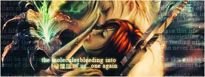
    The stock was VERY quickly and rudely cut, so if you see jagged edges that is why. They were from a manga(b&w, which usually isn't my strong suit I believe). Oddly for a quick job with little thought, it is one of the few 'recent' ones I have made that I am pretty much happy with(the other being the Sakurahana one currently in my signature).
    Last edited by ShunNakamura; 03-07-2009 at 02:06 PM.


    STILL Updating the anime list. . . I didn't think I was that much of an anime freak! I don't even want to consider updating the manga list!

  2. #272
    Polaris's Avatar
    Join Date
    Apr 2004
    Location
    Sunny Portugal
    Posts
    6,186
    Blog Entries
    1

    Default

    wow this one rocks Really really enjoyed it

  3. #273
    Grimoire of the Sages ShunNakamura's Avatar
    Join Date
    Nov 2004
    Location
    Northwest Ohio
    Posts
    2,919

    Default

    Quote Originally Posted by Polaris View Post
    wow this one rocks Really really enjoyed it
    Funnily it seems that sometimes the quick ones are the best! Of course the quick ones have also sowed some of the most embarrassing stuff ever created!

    I rendered this-

    to make this

    And yes the left most image was so badly 'rendered' by me that I probably should be shot for it. Anyways another quicky meant purely to generate a laugh or two. Poor Rin, I love it when she is tormented!


    Now all I need to do is find someway to use the below in a signature.


    STILL Updating the anime list. . . I didn't think I was that much of an anime freak! I don't even want to consider updating the manga list!

  4. #274
    Depression Moon's Avatar
    Join Date
    Aug 2007
    Location
    Warrior Falls
    Posts
    6,050
    Articles
    45
    Blog Entries
    2
    Contributions
    • Former Editor

    Default

    You are quite talented there Ms.?
    I can't make a sig in Gimp for the life of me! The colors seem to really pop out.

  5. #275
    Some kind of Nature~ Fonzie's Avatar
    Join Date
    Jun 2005
    Posts
    6,079
    Contributions
    • Former Site Staff

    Default

    Go get Photoshop.

  6. #276
    Polaris's Avatar
    Join Date
    Apr 2004
    Location
    Sunny Portugal
    Posts
    6,186
    Blog Entries
    1

    Default

    The pop-out sig could be bigger! it's nice to have bigger to see the details
    I said that one rocked because it was different it didn't have all that grungy stuff! It's cleaner ^^

  7. #277
    Depression Moon's Avatar
    Join Date
    Aug 2007
    Location
    Warrior Falls
    Posts
    6,050
    Articles
    45
    Blog Entries
    2
    Contributions
    • Former Editor

    Default

    Quote Originally Posted by Fonz View Post
    Go get Photoshop.
    I don't want to risk another virus.

  8. #278
    Grimoire of the Sages ShunNakamura's Avatar
    Join Date
    Nov 2004
    Location
    Northwest Ohio
    Posts
    2,919

    Default

    Well I saw an animated 'tag' as an entry in Sakurahana's signature competition. I was lazy this time around for the lucky star theme. So I went and did this .


    My comment is as follows: He is awfully calm for a dead man .


    STILL Updating the anime list. . . I didn't think I was that much of an anime freak! I don't even want to consider updating the manga list!

  9. #279
    Polaris's Avatar
    Join Date
    Apr 2004
    Location
    Sunny Portugal
    Posts
    6,186
    Blog Entries
    1

    Default

    AWWWWW LUCKY CHANNEL! >.< so awesome!

  10. #280
    Some kind of Nature~ Fonzie's Avatar
    Join Date
    Jun 2005
    Posts
    6,079
    Contributions
    • Former Site Staff

    Default

    Quote Originally Posted by Depression Moon View Post
    Quote Originally Posted by Fonz View Post
    Go get Photoshop.
    I don't want to risk another virus.
    Ergh, Torrent anyone?

  11. #281
    Grimoire of the Sages ShunNakamura's Avatar
    Join Date
    Nov 2004
    Location
    Northwest Ohio
    Posts
    2,919

    Default

    Yay! Another update!

    There is NO brushing or even C4D's involved in this. I wanted to see what I could do with layering, layer effects, and selective cropping alone. May not be done. If I can figure some brushing that would improve it I will do so.

    Things I think I should try to do is selectively sharpen the building(s) somewhat. They blend a bit too much for my tastes currently. But I obviously don't want to overpower the scenery with it(the buildings are merely an addition to the scenery). The goal here was to create a landscape/scenery type deal. I think I succeeded well enough, though I don't see a focal point or true flow in the image(but I have trouble seeing focal points in the first place).


    STILL Updating the anime list. . . I didn't think I was that much of an anime freak! I don't even want to consider updating the manga list!

  12. #282
    Polaris's Avatar
    Join Date
    Apr 2004
    Location
    Sunny Portugal
    Posts
    6,186
    Blog Entries
    1

    Default

    I like it, I do think colors might need others like the red on the girl with bat wings. Color work will help you choosing a focal point

  13. #283
    Grimoire of the Sages ShunNakamura's Avatar
    Join Date
    Nov 2004
    Location
    Northwest Ohio
    Posts
    2,919

    Default

    You mean getting rid of the red, like this? Or were you talking about something else?


    The problem with focal points is even if I try to apply some of the focal point rules that I know; I don't know if it is working or not. The easiest example is "The Last Supper" painting. To my eyes there is no focal point in that painting. Once it is explained I can follow it easily enough. But I can't see it until it is spelled out for me.

    The example here is that I placed the angel demon pair exactly on the division point of light and dark figuring that the contrast(and that the demon is in the dark and the angel on the light, more or less) would help act as a focal. Add that to the fact that the bg is fairly mild and the render decently strong. Shrug. In theory it should work. But I don't see a focal. And I have been told I often lack a focal in my work.


    STILL Updating the anime list. . . I didn't think I was that much of an anime freak! I don't even want to consider updating the manga list!

  14. #284
    Polaris's Avatar
    Join Date
    Apr 2004
    Location
    Sunny Portugal
    Posts
    6,186
    Blog Entries
    1

    Default

    Well the focal point is easier when you have someone in the middle! For an example here:


    Even though there are two people: Tidus and Yuna, they are both in the middle and they also have a scenario behind it. Even though there are several colors, making the focal point in the middle and background not crowd is the best example how to be sucessful in creating a focal point.

    Work more in colors, gradient maps, photoshop actions, color balance they are all very good

  15. #285
    Grimoire of the Sages ShunNakamura's Avatar
    Join Date
    Nov 2004
    Location
    Northwest Ohio
    Posts
    2,919

    Default

    Hate to say this but my focus isn't focused on that image. Though that one is easy to know why. Shun = Text oriented. No matter what the image is if his initial scan spots anything resembling readable text he goes there first. So my eyes are bouncing all over that image. Though I am beginning to think I have been reading too much manga as of late. I am starting to naturally begin from right to left(it used to be the other way around).


    Ah well, personally I want to focus on my backgrounds for the next few works(this also means less text which means I may be able to work a bit more on recognizing focals). I feel I have been cutting corners with backgrounds for ages now. Just brush, C4D, or the ilk and go. Boring. I would much rather work on the type of BG that this one has. It is just that when I started I used to put a lot of thought, if not skill/effort, into my backgrounds. But I don't feel as if I have done that in a while(well I did but a fair bit of effort into the Sakurahana one, but I was mostly just playing with what I could do with layering effects, so the result was non-intended).


    Edit- Odd I just realized I never posted up the prior signature I made using the World War II image(the one I used to make the buildings in this most recent one. It is also what inspired the 'design' for another of the recent ones I did here... though oddly it seems imageshack bugged out on me again. Imageshack is really beginning to disappoint me ). Well here it is. I suppose it never got uploaded because I considered it a WIP. I didn't like it without the overlay effects. But the overlay is too much. I just could not find my happy place.

    Oddly I personally have a focus on this one. Which is highly unusual. I almost never focus properly on an image.
    Last edited by ShunNakamura; 03-28-2009 at 07:45 PM.


    STILL Updating the anime list. . . I didn't think I was that much of an anime freak! I don't even want to consider updating the manga list!

Posting Permissions

  • You may not post new threads
  • You may not post replies
  • You may not post attachments
  • You may not edit your posts
  •