Page 1 of 2 12 LastLast
Results 1 to 15 of 27

Thread: Deadly!

  1. #1
    Banned DeathKnight's Avatar
    Join Date
    Jan 2006
    Location
    Zanarkand AKA NYC
    Posts
    2,689

    Deadly!

    Like my sig? It's not fancy, but it's kick assnssy ;P

  2. #2
    MacWerewolf Owen Macwere's Avatar
    Join Date
    Apr 2006
    Location
    With the angel that saved my world!
    Posts
    5,137

    Default

    By kick assnssy, do you mean because it is angry? and evil? yes I guess you are.
    it is a simple sig, but I like it somehow. it needs lots of things though, some text and well a border.
    I <3 you Polaris
    ~Antratica forum~ You know you want to join =p

  3. #3
    Banned DeathKnight's Avatar
    Join Date
    Jan 2006
    Location
    Zanarkand AKA NYC
    Posts
    2,689

    Default

    Quote Originally Posted by Owen Macwere
    By kick assnssy, do you mean because it is angry? and evil? yes I guess you are.
    it is a simple sig, but I like it somehow. it needs lots of things though, some text and well a border.
    Thank you thank you, comments much appreciated.

    Um I DO disagree with your comments on "needing more" I mean, I hate sigs with lots of words it it, it makes you look away(IMO). And borders are for neat things, sigs are meant to be raw and expressive

  4. #4
    MacWerewolf Owen Macwere's Avatar
    Join Date
    Apr 2006
    Location
    With the angel that saved my world!
    Posts
    5,137

    Default

    haha... the border give the sig a neat shape. you know what border ism right? look at mine see the white outline this is border. and about text. yes mine is a little more full then suppose but I like it this way, and it wont hurt to put at lest your name in yours ^_~.
    I <3 you Polaris
    ~Antratica forum~ You know you want to join =p

  5. #5
    Nerfed in Continuum Shift Recognized Member Zeromus_X's Avatar
    Join Date
    Sep 2005
    Location
    Phoenix, AZ
    Posts
    7,593
    Contributions
    • Former Cid's Knight

    Default

    It is a great signature, but did you make it?

  6. #6
    Banned DeathKnight's Avatar
    Join Date
    Jan 2006
    Location
    Zanarkand AKA NYC
    Posts
    2,689

    Default

    Quote Originally Posted by Zeromus_X
    It is a great signature, but did you make it?
    Thanks! Of course I made it! I'm the only Kratos....God Of War..Kratos fan in EOFF

    You've got great taste Zeromus, your Kratos is just as great.

  7. #7
    Nerfed in Continuum Shift Recognized Member Zeromus_X's Avatar
    Join Date
    Sep 2005
    Location
    Phoenix, AZ
    Posts
    7,593
    Contributions
    • Former Cid's Knight

    Default

    Kratos: Now in ToS and GoW flavors.

  8. #8
    Paganini is a bastard. Rengori's Avatar
    Join Date
    Jun 2005
    Location
    Under Avarice's bed (Los Angeles)
    Posts
    8,147

    Default

    Have you tried making it so it like converges at the center?
    JOY IS A BITCH, but she is so adorable!
    generated by sloganizer.net
    Kaycee says (12:06 AM):
    whos' obama?

  9. #9
    Will be banned again Roto13's Avatar
    Join Date
    Nov 2005
    Location
    On the INTARWEB
    Posts
    14,570

    Default

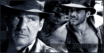
    It's just two cropped images thrown together.

  10. #10
    Banned Sylvie's Avatar
    Join Date
    Aug 2004
    Location
    Hell
    Posts
    4,136
    Blog Entries
    4

    Default

    It doesn't look like it took any more than 2 minutes to make. You should try cutting the images out and putting them on the same background, as well as adding some sort of border. I like the images used, but try adding some more work into it.

  11. #11

    Default

    It seems basic to me, try using brushes along with the the suggestions already posted.

  12. #12
    Banned DeathKnight's Avatar
    Join Date
    Jan 2006
    Location
    Zanarkand AKA NYC
    Posts
    2,689
    Quote Originally Posted by DeathKnight
    Quote Originally Posted by Owen Macwere
    By kick assnssy, do you mean because it is angry? and evil? yes I guess you are.
    it is a simple sig, but I like it somehow. it needs lots of things though, some text and well a border.
    Thank you thank you, comments much appreciated.

    Um I DO disagree with your comments on "needing more" I mean, I hate sigs with lots of words it it, it makes you look away(IMO). And borders are for neat things, sigs are meant to be raw and expressive
    Do I need to repeat myself again?

  13. #13

    Default

    those comments are rather harsh. He wants to use his own style and you guys should read before criticizing because what if he didn't want to blend it or make those effect by using his perspective of sigs, you can then judge that the signature is very cool and deadly

  14. #14
    Banned Sylvie's Avatar
    Join Date
    Aug 2004
    Location
    Hell
    Posts
    4,136
    Blog Entries
    4

    Default

    Yeah, forgive me for saying this, but I don't see much work in that sig. Its just, 2 images thrown together. As I am a sig maker, I feel terrible for saying that, but a sig should be worked on, not just slopped together.

  15. #15

    Default

    everyone just follow my lead...he obviously doesnt want constructive criticism or chill out cuz KRATOS is a god of war and u know what war gods do... beat the **** outta ppl with toasters

    nice sig... I like the fire

Posting Permissions

  • You may not post new threads
  • You may not post replies
  • You may not post attachments
  • You may not edit your posts
  •