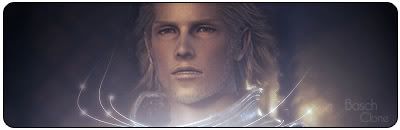
1st one is, simple like you said, simple but nice.
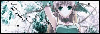
My only problem with the second one is that its a bit unoriginal. The cool signatures are the ones that have unique renders and styles. That Lenne/Yuna one is a really wellknown render.


1st one is, simple like you said, simple but nice.
My only problem with the second one is that its a bit unoriginal. The cool signatures are the ones that have unique renders and styles. That Lenne/Yuna one is a really wellknown render.
Love that "plain" one :] Very vibrant colors, good blending, its got emotion, very well done
Well a sig doesn't need to be complx to look great, simple sigs might come out greater than complex ones.
and I can see nothing wrong with these too, except your text, just work with layer blendings and you will bee cool.
I loved the second one, BTW.

Thanks for the site
Here another one
Last edited by 4evarisha; 08-13-2006 at 10:53 PM.
warriorboy && battlingbard.
Now THAT one I like. Very original, infact i've never seen those renders before.
I like the brightness.
that one is cool, nice blending. and I think the text belnding is not that good try to put stroke around it, so it be more visible.
great work, nevertherless....
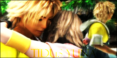
Wow I didnt even see the text. lol. I think thats a sign that you should make it more visible. Yellow on Yellow is hard to see, the colour is awsome. Its like a rich, deep yellow. Almost gold. But yeh, it's hard to see. I think this one, and your lightblue RIkku one are the best youve made.
I love the sigs... but next time I think you should get better text:) If you want...^^ Well, this isn't meant in a bad way okay?:)

RenoB00B00<3
Nice sigs i like the Tidus in Yunas eye one most. But the text is putting it down. Are u turning the AA for it on? Might clear it up.
Made by me
Simple and attractive sigs, lvery good blending as well, I like this work.
My favs are your Rikku one and the Tidus eye one.
Very nice work here!
My new ones
Here is another one!

Last edited by 4evarisha; 04-08-2007 at 10:02 PM.
warriorboy && battlingbard.

I like your sigsthey have a soft, kind of feathery feel to it. It's nice. Your last signature is good too, but I almost didn't realize the font was there the first time, it blended in too much. But if that's what you wanted it to do, good job. I almost didn't notice it. xD
♪ wheee!
:hello: WHAT HAPPENED TO THE HELLO KITTY SMILEY :hello:
That FF13 is a very cool one, the colours are very nice.
for the text just put black 1 pxl stroke around it and it should be good. Best of luck in the next comp.
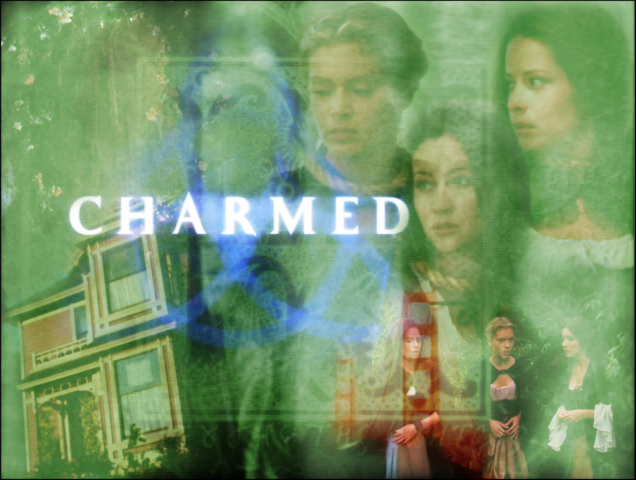
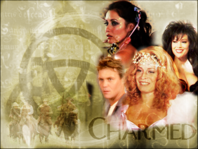
I made three new wallpapers hope you guys like it
I focused alot on blending the background the green one is not that nice lolHope you guys like it
warriorboy && battlingbard.
 Posting Permissions

 Reply With Quote