Oooh they're good! I'm not sure about the green one, the blendings good but it just doesn't look right. But I LOVE the other two. Really nice colours, great placement of the images and great blending.
And also, I love Charmed!


Oooh they're good! I'm not sure about the green one, the blendings good but it just doesn't look right
♥

you really improved:]]

RenoB00B00<3
That one's cool too! I love the colour.
♥

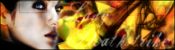
Sorry for double post but here is a my new sigs

warriorboy && battlingbard.
Erm...it's quite a sig...but both uses same colour is like kinda dull...or should say...lack of colours?And other than the text in the 2nd sig that looks kinda choppy...others are cool...
想要對妳說的 不敢說的愛
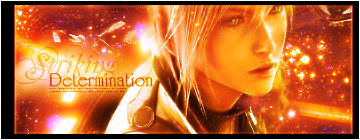
My other sigs
Hope you guys like them
warriorboy && battlingbard.
Originally Posted by 4evarisha
 I like these two the most, really clean and cool.
The first one is quite simple and plain but looks good anyway. xD
And the second one has great effects, just one thing though, the text is quite hard to read. xD
Great work!
♥
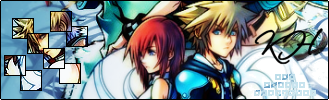
My New Sigs!

Last edited by 4evarisha; 02-06-2007 at 05:46 PM.
warriorboy && battlingbard.

First is really cool with the BG and colours. not fan of the text though, but nice job on that sig.
Second is too plain and the colours are so strong. text not great either.
keep at it, you've improved alot.
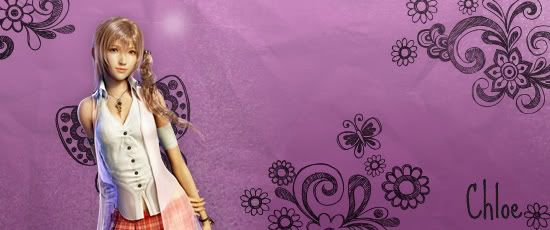
My lastest signature.

warriorboy && battlingbard.
Oh, transperancy. Nice clean edges I say. very smooth and the sig is clean. It reminds me of the sig Feona17 used to use. Great job.

OMG joanie! I love her!
They are really good and your improving!!!! Thats great!!
My sig and avy are made by me.
My latest sig!
Last edited by 4evarisha; 04-08-2007 at 09:37 PM.
warriorboy && battlingbard.

i like that one
 Posting Permissions

 Reply With Quote