Wow you are good, some of thoses sigs scare me though


Wow you are good, some of thoses sigs scare me though
Offline/Online
Excellent. Simply excellent. Keep going man.
3 new ones. well 2 new and i redid the vincent one.


You kick ass, my friend.

Wow, I absolutely love the text in the Vivi one, and I'm loving the style on all of these. Expect a request from me in the future.
Thank you Hysterian!


Cmon I know you can do better than that.
See how much better it loosk with text? You got the kindve goofy text for quina, thats awsome. And the curvy interesting text for vivi. Very good.
The green one of Quinas great. Green goes quite well actually.
Not sure about the Vivi one. The blue/black look doesnt really work. And vivi's famous gold eyes have been made blue.
You tend to colour over the entire signature with one particular colour. That CAN be good. For eg. a concrete effect for the arthas one above. That was mad. But see the Quina one? How he isnt blended with the background. I reckon thats the way to go.
EDIT - I like how you used two renders of Vivi. Rather than just the one.
Wow, the Quina one is so cool, very good BG and colours, I guess having many colours in the sig looks better than one. (that's just me).
anyway, I like the Vivi one too, nice font.
I'd say he puts 2 pictures in a sig, and actually succeeds on making it look good. I mean, I've seen some newbies request sigs with about 4 pictures, and it kills the idea of a signature. Even 2 pictures can, but this guy makes it look good.
Heres 2 more.
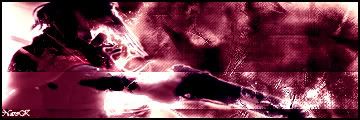
And with this next one i need some tips or pointers for it. The renders take up most of the pic so im not sure what to do.

I like the first one. The second one is just okay. Too many pictures at once. Try either reducing the size or making the canvas size of the sig bigger, if you want 3 pics in it.
The first one is scary... but cool colours, and blending.
the second one looks ok to me, I like renders that takes most of the canvas place.
over all good work, like your BG especially.
Wow I like Your work, I wish I could make my sigs look like yours, lol. I like the Quina one so cool! Anyway can't wait to see more of your work.
The pokemon sig's colours is associated with the pokemon itself. Always good to have.
The 2nd one. I didnt bother me till genji pointed it out. It's not that big an issue. But 3 renders in a 360x120 signature is a tight squeeze. The idea is good though, the 2 guardians and the summoner.
Keep going. Your one of my favourite sig makers ATM.
3 new ones.
i was keen for this luffy one but i didnt work out too good.

COOL, I like the first and last, really good work, I like your style so much, keep going.
 Posting Permissions

 Reply With Quote